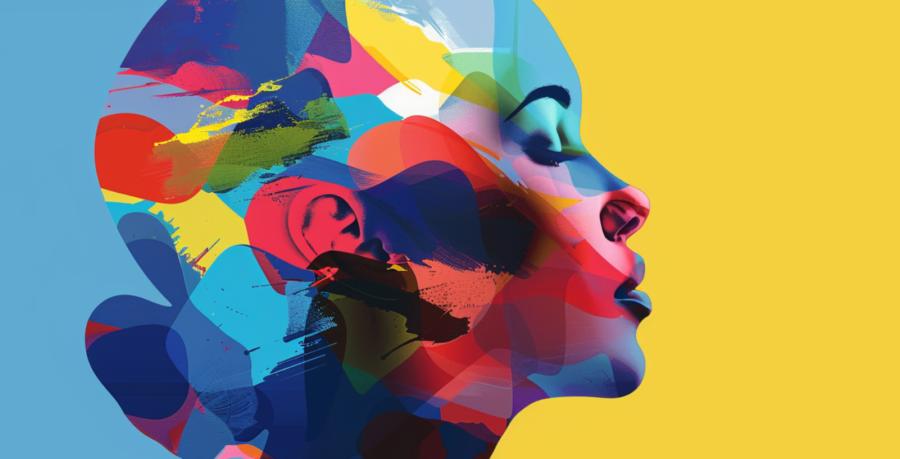
Color Psychology in Web Design: How Different Hues Influence User Behavior in Office Premises
 If your office walls could talk, they'd probably ask for a fresh coat of paint. While the impact of wall colors in an office might seem trivial, the psychology of color plays a significant role in how employees feel and behave. Just like choosing the right color for your website can influence user engagement and experience, selecting the right hues for your office environment can significantly affect productivity, mood, and overall job satisfaction.
Blue: The Calm Motivator
Blue is often associated with tranquility and reliability. It's no surprise that many tech companies and financial institutions use blue in their web design to instill a sense of trust and stability. In an office setting, blue can help to reduce stress and create a calm working environment. Imagine a room full of people calmly clicking through a website because the serene blue hues are telling their brains that everything is under control. However, too much blue might turn your office into a scene from a sad indie movie, so balance it out with warmer accents.Red: The Energy Booster
Red is the color of passion, energy, and urgency. It's a fantastic hue for call-to-action buttons on websites, urging users to take immediate steps. In the office, red can be used strategically to boost energy and enthusiasm. Picture a sales team surrounded by red accents, suddenly feeling like they're in the middle of an exciting race to close the next big deal. But remember, too much red can be overwhelming and lead to increased stress, so use it sparingly – perhaps in meeting rooms where you need that extra boost of energy.Yellow: The Creative Spark
Yellow is the color of creativity, optimism, and cheerfulness. It's great for sparking innovative ideas and keeping spirits high. Web designers use yellow to highlight important information and make users feel more upbeat while navigating a site. In an office, yellow can inspire creativity and foster a positive atmosphere. Imagine a brainstorming session in a room with bright yellow accents – ideas bouncing off the walls as quickly as your team can jot them down. However, too much yellow can cause anxiety, so it's best to use it in moderation and combined with other colors.Green: The Balance Keeper
Green symbolizes growth, harmony, and balance. It's easy on the eyes, making it perfect for websites that want to promote a sense of balance and calmness. In an office, green can reduce fatigue and maintain concentration, thanks to its restful qualities. Visualize a room filled with lush green plants and accents, where employees feel both relaxed and focused. Green can also symbolize environmental friendliness, so it's a great choice for companies with eco-friendly missions. Just avoid turning your office into a jungle; a few plants and green walls will do the trick.Purple: The Royal Innovator
Purple exudes luxury, creativity, and wisdom. It's often used in web design to convey a sense of sophistication and exclusivity. In the office, purple can stimulate problem-solving and imaginative thinking. Imagine a strategy room with deep purple accents, where the toughest challenges are met with the sharpest solutions. Too much purple can feel overly extravagant, so it's best to pair it with more neutral tones to keep things grounded.Orange: The Social Connector
Orange radiates warmth, enthusiasm, and creativity. It's a friendly color often used in web design to grab attention and convey a sense of fun and approachability. In an office, orange can promote collaboration and social interaction. Picture a break room with vibrant orange accents, where employees feel encouraged to chat and share ideas, boosting team morale and fostering a sense of community. However, too much orange can be overwhelming, so use it in areas meant for socializing rather than focused work.Black: The Bold Statement
Black is powerful, elegant, and sophisticated. It's a striking color used in web design to create a strong visual impact and convey authority. In an office, black can add a touch of sophistication and make a bold statement. Imagine an executive office with sleek black furniture and accents, exuding confidence and professionalism. While black can be incredibly stylish, too much can make a space feel closed off or intimidating, so it's best used sparingly and paired with lighter colors.White: The Clean Slate
White is associated with cleanliness, simplicity, and openness. It's a versatile color that web designers use to create a sense of space and clarity. In the office, white can enhance focus and create a sense of openness. Visualize a workspace with crisp white walls and minimalist decor, where employees feel a sense of clarity and order. However, too much white can feel sterile or cold, so it's important to add some color accents to keep the space inviting.Gray: The Neutral Ground
Gray is balanced, neutral, and sophisticated. It's often used in web design as a background color to let other elements stand out. In an office, gray can provide a neutral backdrop that promotes focus and professionalism. Picture a conference room with soft gray walls and furniture, creating a calm and neutral environment where ideas can take center stage. While gray can be very calming, too much can feel drab, so it's important to incorporate some colorful accents to liven up the space.Wrapping Up
Choosing the right colors for your office and web design is more than just an aesthetic decision; it's about creating an environment that influences behavior and enhances user experience. By understanding the psychology of color, you can create a workspace that not only looks good but also feels good to work in. Whether it's the calming blue hues that foster focus or the energetic reds that drive enthusiasm, the colors you choose can make all the difference. So, the next time you consider repainting those office walls or redesigning your website, remember that every hue has a story to tell and a mood to set. Just don't go painting the whole place neon pink – unless you're running a candy factory, that is.And there you have it – a colorful guide to using hues wisely in your office and web design to boost mood, productivity, and engagement. Who knew a splash of color could make such a difference?
Latest Articles
- The Psychology of Ceiling Height: How Vertical Space Changes the Way We Feel
- The Hidden Power of Product Demonstrations: Why Showing Beats Telling
- Beyond Family Portraits: Unexpected Photos That Make Stunning Wall Art
- Designing for Trust: The Hidden Visual Signals That Shape First Impressions
- Why Banner Design Is Still One of the Most Effective Local Marketing Tools
- Designing for Impatient People, and Why That's a Good Thing
- Borrowing Film Planning Techniques for Better Graphic and Web Design
- Designing with Light Instead of Filters: How Atmosphere Shapes a Photograph
- The Scent Wardrobe Principle: Designing Your Fragrance Collection Like an Interior Space
- How Small Visual Details Change the Entire Mood of an Image
- Turning Everyday Lighting Into a Design Feature
- Designing Photo Albums That People Actually Revisit
- Designing Illusions: How Sliding Wardrobe Doors Can Visually Reshape a Room
- Fit Over Fashion Why Tailoring Matters More Than Trends for Formalwear
- Why Fast Websites Matter More Than Beautiful Ones When People Are Choosing Where to Eat
- When Product Photos Quietly Sabotage Online Sales
- When a Wedding Day Quietly Becomes Its Own Photographer
- Why Gilded Elements in Art Still Resonate Today
- Why Your Product Photos Should Tell a Story
- Crafting Interiors That Help Music Truly Come Alive
- Architecture
- Graphic Design
- Web Design
- Industrial Design
- Interior Design
- Fashion Design
- Photography
- Product Design
- UI/UX Design
- Landscape Design
- Animation
- Industrial Engineering
- Packaging Design
- Branding and Identity Design
- Exhibit Design
- Advertising Design
- Typography
- Motion Graphics
- Sustainable Design
- User Research
- Fashion Merchandising
- Film and Video Production
- UX Writing
- Environmental Design
- Print Design
- Interaction Design
- Art Direction
- Textile Design
- Game Design
- Virtual Reality (VR) Design
- General Design Principles
- Event and Wedding Design