Responsive Web Design Tips that Keep Your Website Up-to-date
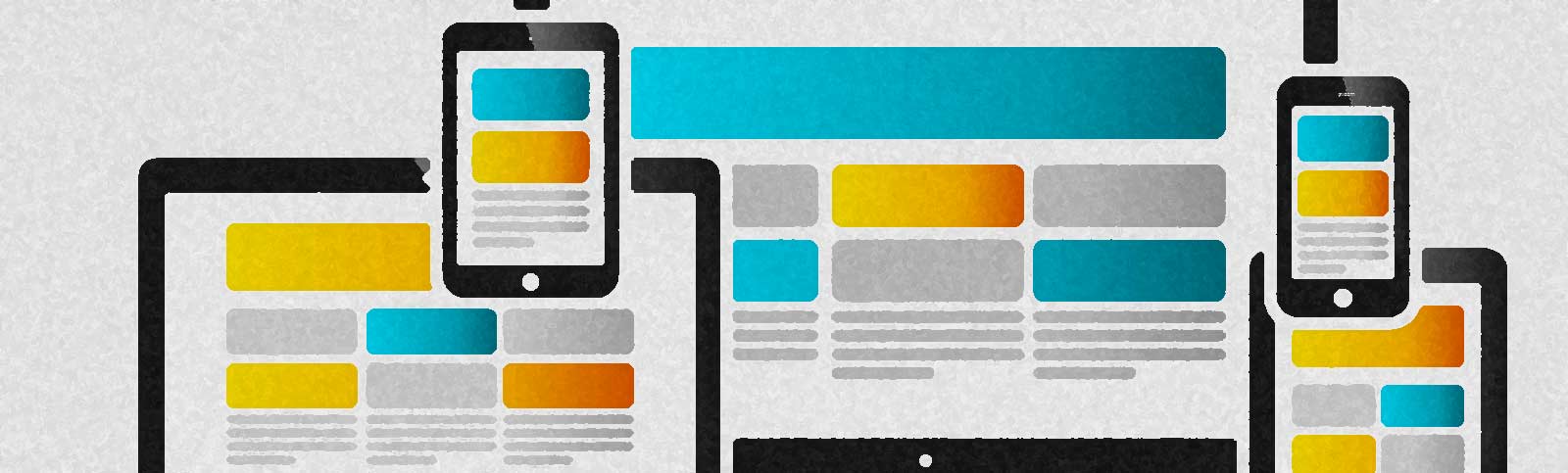 The phrase "responsive web design" has been bandied around by for quite some time now. In case you're new to this idea, responsive web design refers to the process of making a site that renders correctly across a wide range of devices. The method itself must develop as new technologies emerge.
As such, responsive design in 2022 will vary somewhat from that of 2021 and 2020, and so on back through the years. Customers will increasingly anticipate a tailored encounter as technology advances; this should motivate you to maintain your company's lead. The four most important principles and practices of responsive design to remember this year will be discussed.
Increase the Number of 'Microinteractions'
Web designers are increasingly including small, interactive elements into their designs, which has been noted by several in the industry as a trend that started in 2016. Microinteractions are page variables that let users change content without refreshing the page.The addition of "reactions" to Facebook posts" "likes" is a great illustration of this trend. The website will not refresh when you click on a heart, happy face, angry face, or sad face to express how you feel about a post.
Microinteractions are time-efficient and provide a lot of enjoyment to the user experience (UX).
Intelligent Use of Typeface
In addition to the other components of a website that are normally made responsive, you can also develop a font that adapts to the viewing device. For the desktop version, you may use Helvetica at 24 points for the header, but on mobile, you might switch to a lower size of Arial.Some typefaces are more noticeable and effective when seen on a larger screen because they are intended to be shown at a larger size than they would otherwise. On a mobile site, this reduces the effectiveness of the typeface. It might obscure less prominent but more crucial and helpful material from users. The user experience greatly benefits by adapting headings and content to various fonts and sizes for usage across a variety of devices.
Know Your Mobile Devices
While mobile web design has received a lot of press in web design media over the last several years, some industry insiders think it deserves even more consideration. Why? In a nutshell, mobile devices now account for the vast majority of all internet traffic.Therefore, it's important to keep the ideas of applications and websites distinct in your mind. There is a difference between having a responsive website and having a responsive app when it comes to usability and user experience. It's possible, but not certain, that you'll be working on such projects as a web designer.
There are many areas of overlap between developing an app and developing a mobile-category website, but there are also semantic differences that cannot be accommodated by a flexible web design. For instance, A/B testing on a mobile app will need a different approach than on a mobile-friendly website. In any case, though, it's important to think about the variety of possible display sizes.
Grid-based Innovation
The rule of thirds, 12-unit grids, and common column amount grids are just some of the popular grid designs that we have successfully used in the past while creating websites. However, maintaining novelty requires drawing people in, even only on a subconscious level.This is why 2022 is the year you should try something new with your grid designs. To maintain your website's appearance while also setting it apart from others, you'll need a system for organizing your pages. Experiment with white space and the CSS grid to create novel column layouts, or try a different approach to page structure altogether.
Summary
As you can see, responsive design is actually quite a technical aspect of web design, and one that's constantly evolving.
Article kindly provided by empowerwebdesign.com.au
Latest Articles
- The Quiet Design Details That Make Wedding Memories Feel More Personal
- The Psychology of Ceiling Height: How Vertical Space Changes the Way We Feel
- The Hidden Power of Product Demonstrations: Why Showing Beats Telling
- Beyond Family Portraits: Unexpected Photos That Make Stunning Wall Art
- Designing for Trust: The Hidden Visual Signals That Shape First Impressions
- Why Banner Design Is Still One of the Most Effective Local Marketing Tools
- Designing for Impatient People, and Why That's a Good Thing
- Borrowing Film Planning Techniques for Better Graphic and Web Design
- Designing with Light Instead of Filters: How Atmosphere Shapes a Photograph
- The Scent Wardrobe Principle: Designing Your Fragrance Collection Like an Interior Space
- How Small Visual Details Change the Entire Mood of an Image
- Turning Everyday Lighting Into a Design Feature
- Designing Photo Albums That People Actually Revisit
- Designing Illusions: How Sliding Wardrobe Doors Can Visually Reshape a Room
- Fit Over Fashion Why Tailoring Matters More Than Trends for Formalwear
- Why Fast Websites Matter More Than Beautiful Ones When People Are Choosing Where to Eat
- When Product Photos Quietly Sabotage Online Sales
- When a Wedding Day Quietly Becomes Its Own Photographer
- Why Gilded Elements in Art Still Resonate Today
- Why Your Product Photos Should Tell a Story
- Architecture
- Graphic Design
- Web Design
- Industrial Design
- Interior Design
- Fashion Design
- Photography
- Product Design
- UI/UX Design
- Landscape Design
- Animation
- Industrial Engineering
- Packaging Design
- Branding and Identity Design
- Exhibit Design
- Advertising Design
- Typography
- Motion Graphics
- Sustainable Design
- User Research
- Fashion Merchandising
- Film and Video Production
- UX Writing
- Environmental Design
- Print Design
- Interaction Design
- Art Direction
- Textile Design
- Game Design
- Virtual Reality (VR) Design
- General Design Principles
- Event and Wedding Design