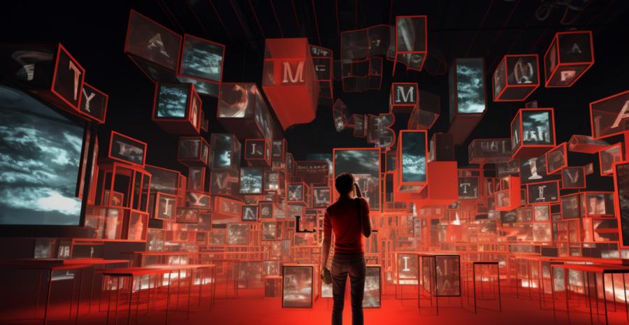
Typography in Virtual Reality: Exploring Text in 3D Spaces
Text in a Brave New World
Virtual reality is the undisputed technology of the future. It is no longer the stuff of science fiction - we have reached the juncture where we can step into a different realm and experience things that were once only confined to our wildest dreams. With great power comes great responsibility, and for typographers, it brings a whole new dimension in design. The challenge then becomes how to master the art of placing text effectively in this brave new world so that it can be consumed, understood, and appreciated by users.Typography's 3D Makeover
Virtual reality takes the familiar 2D printed word and places it within a 3D environment. This might sound like the work of a mad scientist on acid, but it's actually quite the intellectual challenge. Imagine trying to force a square peg into a round hole while juggling flaming torches, and you'll have some idea of what typographers are up against.Text in virtual reality must be legible, unobtrusive, and accessible, all while being aesthetically pleasing. It's a bit like trying to dress a hyperactive octopus in a tuxedo. However, despite the inherent challenges, there are some crucial factors that can aid typographers in conquering this new frontier.
Size Matters: Scaling Fonts for Virtual Reality
In the land of virtual reality, size does indeed matter. If text is too small, it becomes illegible. If it's too large, it will engulf the user like a swarm of angry bees. To find the Goldilocks zone, typographers must pay close attention to the scale, ensuring that it's just right.One key aspect of size is the depth of the text. The closer it is to the user, the larger it needs to be. Conversely, text that appears further away will need to be smaller to maintain legibility. It's a delicate dance of size and scale, but when done right, it will look as natural as a cat playing the piano.
Keep it Clean: Font Choice in Virtual Reality
Designers should bear in mind that while ornate, fancy fonts might look lovely on a wedding invitation, they have no place in virtual reality. In this cutting-edge world, users need to be able to read text quickly, and without straining their eyes. Opt for clean, sans-serif fonts that are easy to read and uncluttered.Hold off on using that calligraphy font you've been itching to try out. Save it for your avant-garde poetry slam, and keep virtual reality text simple and clean. Trust me; your users will thank you.
The Right Angle: Positioning Text in Virtual Reality
Text in virtual reality isn't confined to a flat plane, which means it can appear at different angles in the 3D space. However, one must tread carefully in this new typographic playground. Just because you can make the text float above the user's head, doesn't mean you should.Instead, consider the user's line of sight and ensure that the text is placed where it can be easily read. A good rule of thumb is to position it slightly below eye level, allowing for a comfortable viewing angle. Users shouldn't have to contort their necks like a giraffe trying to reach the top branch just to read your text.
Embrace Change: Dynamic Typography in Virtual Reality
Static text in virtual reality is akin to a corpse at a party. It's a real buzzkill. Embrace change and utilize dynamic typography that adapts to the user's environment. For example, if the user is moving around, the text should adjust its size and position to maintain legibility.This opens up a world of possibilities for typographers. You can create text that follows the user, or text that reveals itself as the user moves closer. Think of it as a high-tech game of hide and seek, with the text revealing itself as the user explores the virtual world.
Stay in the Shadows: Using Depth Cues in Virtual Reality
One of the beauties of virtual reality is its ability to immerse users in an environment through depth and dimension. To maintain this illusion, it's essential to use depth cues in typography. Shadows and shading can create the appearance of text floating within the 3D space rather than appearing as a flat, lifeless entity.By incorporating depth cues, typographers can create a sense of place and position for the text, which ultimately enhances the user's experience. So, don't neglect the shadows - they're not just for lurking in dark alleyways.
In Conclusion: The Future of Typography in Virtual Reality
Typography in virtual reality is still in its infancy, but it's an exciting time for designers and typographers alike. As technology advances and users become more accustomed to virtual reality, the text will continue to evolve and adapt.By keeping these tips in mind and staying ahead of the curve, designers can create engaging virtual reality experiences that leave users eager for more. Dive headfirst into this new realm, and remember - in the world of virtual reality, the only limits are your imagination.
Article kindly provided by designerviews.org
Latest Articles
- The Quiet Design Details That Make Wedding Memories Feel More Personal
- The Psychology of Ceiling Height: How Vertical Space Changes the Way We Feel
- The Hidden Power of Product Demonstrations: Why Showing Beats Telling
- Beyond Family Portraits: Unexpected Photos That Make Stunning Wall Art
- Designing for Trust: The Hidden Visual Signals That Shape First Impressions
- Why Banner Design Is Still One of the Most Effective Local Marketing Tools
- Designing for Impatient People, and Why That's a Good Thing
- Borrowing Film Planning Techniques for Better Graphic and Web Design
- Designing with Light Instead of Filters: How Atmosphere Shapes a Photograph
- The Scent Wardrobe Principle: Designing Your Fragrance Collection Like an Interior Space
- How Small Visual Details Change the Entire Mood of an Image
- Turning Everyday Lighting Into a Design Feature
- Designing Photo Albums That People Actually Revisit
- Designing Illusions: How Sliding Wardrobe Doors Can Visually Reshape a Room
- Fit Over Fashion Why Tailoring Matters More Than Trends for Formalwear
- Why Fast Websites Matter More Than Beautiful Ones When People Are Choosing Where to Eat
- When Product Photos Quietly Sabotage Online Sales
- When a Wedding Day Quietly Becomes Its Own Photographer
- Why Gilded Elements in Art Still Resonate Today
- Why Your Product Photos Should Tell a Story
- Architecture
- Graphic Design
- Web Design
- Industrial Design
- Interior Design
- Fashion Design
- Photography
- Product Design
- UI/UX Design
- Landscape Design
- Animation
- Industrial Engineering
- Packaging Design
- Branding and Identity Design
- Exhibit Design
- Advertising Design
- Typography
- Motion Graphics
- Sustainable Design
- User Research
- Fashion Merchandising
- Film and Video Production
- UX Writing
- Environmental Design
- Print Design
- Interaction Design
- Art Direction
- Textile Design
- Game Design
- Virtual Reality (VR) Design
- General Design Principles
- Event and Wedding Design