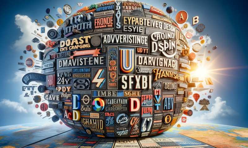
Advertising Design: Navigating the World of Typography
A Tale of Two Typefaces
Picture this: a delightful spring morning, the sun casting its golden rays upon the dew-kissed grass, birds singing their sweet symphony, and a young advertising designer sips their first cup of coffee, ready to face the day. Little do they know, a storm is brewing - a storm that threatens to tear their carefully constructed world asunder. The storm? A heated debate over Helvetica vs. Comic Sans.Know Your Typeface
You see, in the realm of advertising design, typography holds the power to make or break a campaign. It's the first impression, the voice that beckons, the subtle whisper or bold shout that draws the viewer in. So, it's essential to know your Arial from your Times New Roman, your Futura from your Garamond. But fret not, our intrepid designer, for I shall be your guide through this wild, wonderful world of letters and glyphs.Classic vs. Modern: A Battle for the Ages
Some may argue that a classic typeface, like the ever-popular Helvetica, is the safest bet. After all, it's clean, legible, and versatile - a veritable Swiss Army knife of typefaces. But I ask you, is "safe" always the best choice? Does not the siren call of a modern, edgy typeface like Bebas Neue lure you with its sleek lines and minimalist charm?And don't even get me started on the controversy that surrounds Comic Sans! Yes, it may be the typeface equivalent of a carnival barker, luring unsuspecting passersby with its playful demeanor, but there is a time and place for such jollity. Tread carefully, young designer, for the wrong typeface can spell doom for your advertising campaign.
Size Matters
Once the great typeface debate has been settled, we move on to the matter of size. For, as they say, size matters. And in the world of typography, it holds even more truth. Too small, and your message is lost, a mere whisper in a cacophony of visual noise. Too large, and it becomes a garish eyesore, repelling potential viewers like a moth from a flame.The key, my friends, is balance. To find that sweet spot, that perfect pairing of typeface and size that brings harmony to your design. It may seem an insurmountable task, but fear not, for your trusty guide is here to impart wisdom and advice.
A Touch of Style: Bold, Italic, and Beyond
Now that we've conquered the realms of typeface and size, we delve deeper into the world of typography, a place where style reigns supreme. Bold, italic, underlined - these are the tools at your disposal. The magic wands that can transform your humble text into a work of art.But beware, young designer, for with great power comes great responsibility. Use these tools wisely, for they can just as quickly turn your masterpiece into a chaotic mess. Remember that subtlety is key, and a light touch may often be all that is needed to elevate your design to new heights.
Color Me Impressed: Typography and Color
As we navigate through the labyrinthine world of typography, we stumble upon yet another element that can make or break your advertising design: color. The right hue can make your text pop, drawing the viewer's eye like a moth to a flame (are you sensing a theme here?). But choose poorly, and your text may become an indecipherable blob, leaving your audience disoriented and confused.So, tread carefully, our intrepid designer, as you select your palette. Consider the emotional response the colors may evoke, and ensure they support, not detract, from your message.
In Conclusion: The Power of Typography
And so, we come to the end of our journey through the world of typography in advertising design. We've traversed the lands of typeface, size, style, and color, and emerged wiser and more capable designers for it. But remember, young designer, the power of typography is not to be taken lightly, for it can make or break your advertising campaign.So, wield this power with care, trust your instincts, and may your advertising designs be forever blessed with the perfect typographic touch.
Article kindly provided by designerviews.org
Latest Articles
- Why Banner Design Is Still One of the Most Effective Local Marketing Tools
- Designing for Impatient People, and Why That's a Good Thing
- Borrowing Film Planning Techniques for Better Graphic and Web Design
- Designing with Light Instead of Filters: How Atmosphere Shapes a Photograph
- The Scent Wardrobe Principle: Designing Your Fragrance Collection Like an Interior Space
- How Small Visual Details Change the Entire Mood of an Image
- Turning Everyday Lighting Into a Design Feature
- Designing Photo Albums That People Actually Revisit
- Designing Illusions: How Sliding Wardrobe Doors Can Visually Reshape a Room
- Fit Over Fashion Why Tailoring Matters More Than Trends for Formalwear
- Why Fast Websites Matter More Than Beautiful Ones When People Are Choosing Where to Eat
- When Product Photos Quietly Sabotage Online Sales
- When a Wedding Day Quietly Becomes Its Own Photographer
- Why Gilded Elements in Art Still Resonate Today
- Why Your Product Photos Should Tell a Story
- Crafting Interiors That Help Music Truly Come Alive
- Why Packaging Design Matters Even for Digital Products
- Color Palettes That Evolve: Creating Schemes That Shift With Time of Day, Mood, or User Context
- Exploring Subtle Details Found in Quality Swiss Timepieces
- How Adaptive Cabin Environments Let Chauffeured Executives Shift Effortlessly Between Rest and Focus
- Architecture
- Graphic Design
- Web Design
- Industrial Design
- Interior Design
- Fashion Design
- Photography
- Product Design
- UI/UX Design
- Landscape Design
- Animation
- Industrial Engineering
- Packaging Design
- Branding and Identity Design
- Exhibit Design
- Advertising Design
- Typography
- Motion Graphics
- Sustainable Design
- User Research
- Fashion Merchandising
- Film and Video Production
- UX Writing
- Environmental Design
- Print Design
- Interaction Design
- Art Direction
- Textile Design
- Game Design
- Virtual Reality (VR) Design
- General Design Principles
- Event and Wedding Design