Beyond the Straight Angle in 3D Visuals and Why Your Beige Render Might Be Sad on Purpose
 Color isn't just decoration. It's persuasion, subversion, tension, or relief, all before the viewer even realizes what they're looking at. In 3D visuals, it's one of the few tools that speaks louder than geometry, yet gets treated like an afterthought too often—like cilantro in a curry: thrown in because someone said it was important.
 This is your invitation to stop making sterile renders that feel like a dental waiting room and start using color, light, and tone to actually say something. Even if that something is "please buy this sleek industrial chair that may or may not double as modernist sculpture."
Hue You Lookin" At?
Color psychology isn't just a marketing buzzword from 2009. It's still how our brains decide whether to trust what we see—or run screaming. In the world of 3D design, picking the right color palette can mean the difference between a viewer leaning in with curiosity or closing the tab with the speed of a startled cat.Red screams urgency. Blue whispers stability. Yellow? Cheerful, yes, but potentially one ill-judged shade away from "child's playroom" or "warning sign." The goal is not just to know what colors evoke, but to learn how those associations shift depending on culture, saturation, and context. A desaturated red in a luxury product render feels refined; crank the saturation and suddenly it's a fire engine.
Also, don't forget temperature. Warm tones pull things forward, like they're basking in a sunbeam. Cool tones recede, creating calm—or corporate gloom, depending on how you use them. The magic happens in the balance, or more accurately, the tension.
Light Is Color's Puppet Master
Color doesn't live in isolation. Light controls its behavior like an overbearing director. Direction, intensity, and warmth all shape how a material looks and how a viewer feels. Want your product to feel high-end? Try a soft key light with warm undertones and just enough bounce to tease detail into the shadows without flattening contrast.You can use lighting temperature to manipulate emotional tone with surprising ease. Cool lighting can make a chrome finish look sterile, clinical, or space-age—depending on your intention. The same object under golden-hour lighting? Suddenly it's a lifestyle piece. A glass of wine away from an aspirational ad campaign.
Directional light creates shape and emotion at the same time. Overhead light flattens and depersonalizes. Side light sculpts. Backlight romanticizes or mystifies. And if your lighting setup makes your 3D render look like it's being interrogated by airport security, rethink your bounce fills.
Texture and the Psychology of Touch (Without Touch)
A 3D image can't be touched, but a convincing texture can fool the eye into triggering tactile memory. Rough textures feel earthy, honest, maybe even "eco." Smooth surfaces feel manufactured, modern, and often cold. The shinier it is, the more likely someone's brain registers it as expensive—or in desperate need of a fingerprint wipe.This is especially true in product visuals. If your texture work is too clean, it might feel fake. Too gritty, and now you're making indie horror. The trick is micro-imperfection: tiny surface inconsistencies that mimic the real world just enough to feel authentic without descending into uncanny valley.
And yes, you can mix materials. You should. Nothing says "I'm thinking about emotional context" like contrasting matte ceramic against brushed metal. It's the 3D artist's version of playing jazz.
Tone and the Mood It Sets When Nobody's Watching
Tone is the sum of all parts—your color palette, your lighting, your composition—and it's what tells the viewer how to feel. It's also the part people notice only when it's wrong. An image meant to feel intimate can be ruined by a cool temperature shift. A bold, loud concept might fall flat under moody shadows and neutral tones.Tone guides the experience. It's the difference between aspirational minimalism and "I forgot to add furniture." A 3D render with the right tone doesn't shout its purpose—it just feels right. And if it doesn't? It lingers awkwardly like a joke that didn't land.
Practical Tips to Stop Making Emotionally Blank Renders
Now that we've untangled the emotional wiring behind hue, light, texture, and tone, let's bring it down to earth with some actionable advice. These aren't grand theories—they're the practical, tested choices that separate work that just looks "fine" from work that connects.- Start with a Mood Board, Not a Color Wheel – Don't pick colors because they "go well together." Pick them because they align with the feeling you're trying to evoke. Collect references that match the emotion first—color theory comes after.
- Use LUTs Sparingly But Intentionally – Don't just slap on a Look-Up Table and call it a day. Choose LUTs that reinforce the emotional temperature of the image. Want melancholy? Choose one that mutes saturation and leans cool. Want luxury? Push contrast and warm highlights.
- Never Use Pure Black or White – Real-world surfaces absorb and reflect light. A #000000 shadow looks fake. A #FFFFFF highlight looks burned. Use near-black and off-white instead. It adds realism and emotional nuance you didn't know you needed.
- Break the "Golden Hour" Addiction – Warm, late-afternoon lighting is beautiful. It's also in 75% of all renders for a reason: it flatters everything. But not everything should be flattered. Try harsher light or colder shadows if you want tension or drama.
- Preview in Grayscale – Temporarily kill the color to test composition and tone. If the emotional impact holds up without color, you're on the right track. If it collapses, something's wrong with the structure, not just the palette.
Hue Kidding Me?
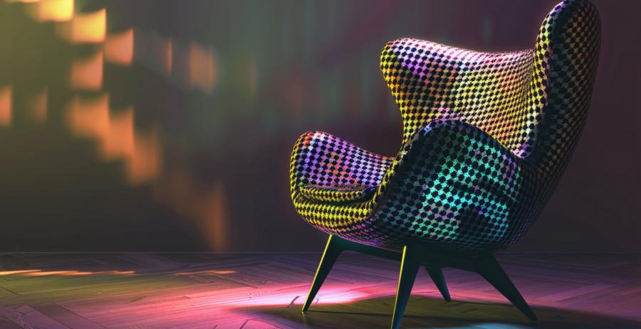
Sometimes, the best use of color psychology in 3D isn't subtle. It's playful. It's bold. It says, "Yes, this couch is bright teal and yes, I meant that." You can absolutely wield absurd colors intentionally if the tone of the project allows it. The trick is owning the decision. Pastels can feel high-end or childish depending on execution. Neons can read as edgy or migraine-inducing.Don't be afraid to make color do the heavy lifting. A monochrome scene in a bold hue, combined with clever lighting and contrast, can sometimes out-emote a hyper-detailed, photorealistic render. Strip things back when needed. Color isn't just accent—it can be narrative.
Hue-Turn at the End
When used deliberately, color in 3D visuals isn't just a finishing touch—it's the silent language driving emotional engagement. Subtle hue shifts can imply luxury, danger, nostalgia, or calm. Texture can hint at touch. Light can imply story. Tone is your truth serum.And remember: if your beautifully modeled furniture piece looks like it belongs in a dentist's lobby, it's probably not the model's fault. It's the color. Or the lighting. Or the tone. But most likely—it's all of them whispering, "We told you beige wasn't a personality."
Use color like you mean it. If your render evokes an emotion, any emotion, you've already outrun most of the beige competition.
Article kindly provided by danthree.studio
Latest Articles
- Borrowing Film Planning Techniques for Better Graphic and Web Design
- Designing with Light Instead of Filters: How Atmosphere Shapes a Photograph
- The Scent Wardrobe Principle: Designing Your Fragrance Collection Like an Interior Space
- How Small Visual Details Change the Entire Mood of an Image
- Turning Everyday Lighting Into a Design Feature
- Designing Photo Albums That People Actually Revisit
- Designing Illusions: How Sliding Wardrobe Doors Can Visually Reshape a Room
- Fit Over Fashion Why Tailoring Matters More Than Trends for Formalwear
- Why Fast Websites Matter More Than Beautiful Ones When People Are Choosing Where to Eat
- When Product Photos Quietly Sabotage Online Sales
- When a Wedding Day Quietly Becomes Its Own Photographer
- Why Gilded Elements in Art Still Resonate Today
- Why Your Product Photos Should Tell a Story
- Crafting Interiors That Help Music Truly Come Alive
- Why Packaging Design Matters Even for Digital Products
- Color Palettes That Evolve: Creating Schemes That Shift With Time of Day, Mood, or User Context
- Exploring Subtle Details Found in Quality Swiss Timepieces
- How Adaptive Cabin Environments Let Chauffeured Executives Shift Effortlessly Between Rest and Focus
- Jewellery as Identity Encryption: Choosing Symbols That Speak Only to You
- From Minimal to Maximal: Print Styles That Actually Fit Your Decor
- Architecture
- Graphic Design
- Web Design
- Industrial Design
- Interior Design
- Fashion Design
- Photography
- Product Design
- UI/UX Design
- Landscape Design
- Animation
- Industrial Engineering
- Packaging Design
- Branding and Identity Design
- Exhibit Design
- Advertising Design
- Typography
- Motion Graphics
- Sustainable Design
- User Research
- Fashion Merchandising
- Film and Video Production
- UX Writing
- Environmental Design
- Print Design
- Interaction Design
- Art Direction
- Textile Design
- Game Design
- Virtual Reality (VR) Design
- General Design Principles
- Event and Wedding Design