Art Direction: The Untold Story of Typography
Why Typography Matters to Art Direction
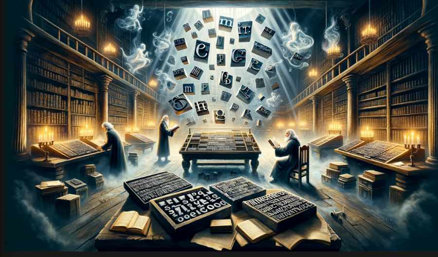
It has been said that typography is the art of controlling the white space within a page. And as a student of the great game called Life, allow me to elucidate on the importance of this underrated aspect of Art Direction. Typography is not just about picking the right font. Oh, no, my friends. It is more than that. It is about understanding the way your audience reads and perceives the text, it is about setting the tone of your communication, and ultimately, it is about creating a harmonious relationship between the text and the visuals.When Typography Went Wild
Let me take you back to the roaring 90s for a brief moment. The World Wide Web was a new frontier, where designers had limited resources and, dare I say, limited taste. When it came to typography, the world was our oyster. We had the likes of Comic Sans and Papyrus, fonts that would make you want to gouge your eyes out with a spoon. And yet, we used them. Oh, how we used them!Art direction, as it were, was an afterthought in those dark days of the Internet. Web designers were the cowboys of the digital frontier, and they rode roughshod over the principles of good typography. However, as the Internet matured, so did our understanding of the importance of typography in art direction.
From Chaos to Order: The Rise of Grid Systems
Enter the 21st century and the advent of grid systems. Grids are the unsung heroes of the design world. They help to bring order to the chaos, and they ensure that the text on a page aligns perfectly with the visuals. A well-designed grid system is like a perfectly choreographed ballet - each element moves gracefully across the stage, never bumping into each other or stepping out of line. This harmonious dance is crucial to effective art direction, as it dictates the flow of information and guides the reader's eye.Breaking the Rules: When Typography Gets Experimental
But what of those daring souls who choose to rebel against the tyranny of the grid? Can there be innovation in the world of typography, or are we doomed to a life of Arial and Times New Roman? Fear not, fellow seekers of truth, for there are designers who choose to break the rules. And sometimes, just sometimes, the results are nothing short of magical.Take, for example, the work of David Carson, the enfant terrible of the 90s design world. Carson's groundbreaking work in the magazine Ray Gun was a shining beacon in the fog of conformity. He threw out the rulebook on typography and created a visual language that was daring, rebellious, and utterly captivating. Carson's work serves as a reminder that even in the seemingly rigid world of typography, there is always room for experimentation and innovation.
Emotions in Typography: The Hidden Power of Fonts
But let us not forget the emotional aspect of typography. Fonts have the power to evoke feelings in the reader. A well-chosen font can set the tone of a piece, whether it is serious, playful, or downright terrifying. Take the humble Helvetica, for example. Its clean, crisp lines make it the perfect choice for corporate communications, but would you use it to promote a horror movie? I think not!Understanding the emotional impact of typography is crucial for any art director worth their salt. It is the secret weapon in the battle for the reader's attention, and it can mean the difference between a successful campaign and a forgettable flop.
Typography: The Unsung Hero of Art Direction
So, there you have it, my friends. A brief journey into the untold story of typography in art direction. From the wild west of the 90s to the refined grid systems of today, typography has come a long way. It is the glue that holds a design together and the key to unlocking the emotional impact of a piece.As you venture forth into the world of art direction, I implore you to consider the humble font. Treat it with the respect it deserves, and your designs will shine brighter than a thousand Comic Sans-infused nightmares.
Remember, my fellow adventurers, typography is not just about what you say, but how you say it. And with that, I bid you adieu."
},
"logprobs": null,
"finish_reason": "stop"
}
],
"usage": {
"prompt_tokens": 400,
"completion_tokens": 964,
"total_tokens": 1364
},
"system_fingerprint": null
}
Article kindly provided by designerviews.org
Latest Articles
- The Quiet Design Details That Make Wedding Memories Feel More Personal
- The Psychology of Ceiling Height: How Vertical Space Changes the Way We Feel
- The Hidden Power of Product Demonstrations: Why Showing Beats Telling
- Beyond Family Portraits: Unexpected Photos That Make Stunning Wall Art
- Designing for Trust: The Hidden Visual Signals That Shape First Impressions
- Why Banner Design Is Still One of the Most Effective Local Marketing Tools
- Designing for Impatient People, and Why That's a Good Thing
- Borrowing Film Planning Techniques for Better Graphic and Web Design
- Designing with Light Instead of Filters: How Atmosphere Shapes a Photograph
- The Scent Wardrobe Principle: Designing Your Fragrance Collection Like an Interior Space
- How Small Visual Details Change the Entire Mood of an Image
- Turning Everyday Lighting Into a Design Feature
- Designing Photo Albums That People Actually Revisit
- Designing Illusions: How Sliding Wardrobe Doors Can Visually Reshape a Room
- Fit Over Fashion Why Tailoring Matters More Than Trends for Formalwear
- Why Fast Websites Matter More Than Beautiful Ones When People Are Choosing Where to Eat
- When Product Photos Quietly Sabotage Online Sales
- When a Wedding Day Quietly Becomes Its Own Photographer
- Why Gilded Elements in Art Still Resonate Today
- Why Your Product Photos Should Tell a Story
- Architecture
- Graphic Design
- Web Design
- Industrial Design
- Interior Design
- Fashion Design
- Photography
- Product Design
- UI/UX Design
- Landscape Design
- Animation
- Industrial Engineering
- Packaging Design
- Branding and Identity Design
- Exhibit Design
- Advertising Design
- Typography
- Motion Graphics
- Sustainable Design
- User Research
- Fashion Merchandising
- Film and Video Production
- UX Writing
- Environmental Design
- Print Design
- Interaction Design
- Art Direction
- Textile Design
- Game Design
- Virtual Reality (VR) Design
- General Design Principles
- Event and Wedding Design