Kinetic Typography: Text that Moves and Engages
What Is Kinetic Typography?
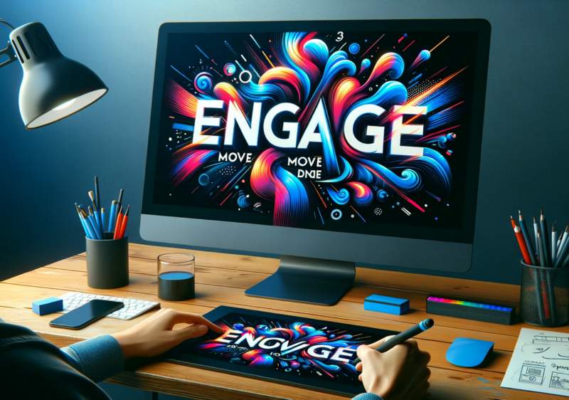
Picture this: you're sitting in a dimly lit room, the hum of a lava lamp buzzing in the background, and you suddenly have the urge to make text dance across the screen like a graceful ballerina or a brawny lumberjack, depending on your mood. Enter kinetic typography - a world where text is more than just a static, boring arrangement of letters. It's a realm where words pirouette, leap, and shimmy their way into the hearts and minds of all who witness their enchanting performance.In a nutshell, kinetic typography is the art of animating text. This can be done through various techniques, such as morphing, moving, or changing its size and color, to create a sense of motion and engagement. It's a way to add some pizzazz to an otherwise dull message and make it truly unforgettable.
The Origins of Kinetic Typography
Like all great things, kinetic typography can trace its roots back to the mid-20th century. Specifically, it was the 1959 film "North by Northwest" that first introduced the world to this mesmerizing technique. Legendary graphic designer Saul Bass, known for his innovative title sequences, created an opening scene in which credits seamlessly blend with the architecture of a New York City building. It was a groundbreaking moment that would forever change the way we look at text on the screen.From there, kinetic typography continued to evolve and gain momentum - quite literally - as it made its way into music videos, commercials, and even educational content. No longer confined to the big screen, this playful art form now graces our laptops, tablets, and smartphones, keeping us glued to our devices with its hypnotic movements.
Why Should You Care About Kinetic Typography?
Why should you care about kinetic typography? Well, aside from the fact that it's an incredibly entertaining way to pass the time, it also offers a plethora of benefits when it comes to communication and engagement. Here are just a few reasons why you should consider incorporating this delightful technique into your next project:- Increases engagement: We live in a world where attention spans are shorter than ever. Kinetic typography is an excellent way to grab and hold the attention of your audience, keeping them engaged and interested in what you have to say.
- Improves comprehension: By using movement and other visual cues, kinetic typography can make complex information easier to understand and digest. It's a great tool for turning potentially dry and boring content into something visually stimulating and memorable.
- Enhances branding: Kinetic typography allows you to play with fonts, colors, and animations that align with your brand identity. It's an opportunity to create a unique and consistent look and feel that differentiates you from the competition.
- Boosts shareability: Let's face it - people love sharing interesting and entertaining content. By incorporating kinetic typography into your videos, you increase the likelihood of your content being shared, liked, and commented on, ultimately expanding your reach.
How to Get Started with Kinetic Typography
Are you ready to dive headfirst into the wonderful world of kinetic typography? Excellent! Just follow these simple steps, and you'll be animating text like a pro in no time:- Select your software: There are plenty of tools out there to help you bring your text to life. From professional-grade applications like Adobe After Effects to free, user-friendly options like Animaker, you're sure to find something that suits your needs and skill level.
- Choose your fonts wisely: When it comes to kinetic typography, not all fonts are created equal. Some are better suited for motion than others, so be sure to select fonts that are legible, versatile, and visually appealing. Also, remember that less is more - stick to a few complementary fonts to avoid overwhelming your audience.
- Plan your animations: Before you start animating, it's essential to have a clear idea of what you want your text to do. Storyboard your ideas, sketching out the various movements and transitions you'd like to incorporate. This will save you time and ensure a cohesive final product.
- Practice makes perfect: Like any other skill, mastering kinetic typography takes time and effort. Don't be discouraged if your first attempts don't turn out as you'd hoped. Keep practicing, experimenting, and learning from your mistakes, and soon you'll be creating captivating text animations that leave your audience spellbound.
Final Thoughts
From its humble beginnings in film title sequences to its current status as a widely used and admired communication tool, kinetic typography has come a long way. This dynamic, engaging technique has the power to breathe new life into text, transforming it into a visual feast that captures the imagination and demands attention.So the next time you find yourself yearning for a way to make your message stand out from the crowd, why not give kinetic typography a whirl? After all, it's not every day you get to make words dance across the screen like a Broadway showstopper.
Article kindly provided by designerviews.org
Latest Articles
- The Quiet Design Details That Make Wedding Memories Feel More Personal
- The Psychology of Ceiling Height: How Vertical Space Changes the Way We Feel
- The Hidden Power of Product Demonstrations: Why Showing Beats Telling
- Beyond Family Portraits: Unexpected Photos That Make Stunning Wall Art
- Designing for Trust: The Hidden Visual Signals That Shape First Impressions
- Why Banner Design Is Still One of the Most Effective Local Marketing Tools
- Designing for Impatient People, and Why That's a Good Thing
- Borrowing Film Planning Techniques for Better Graphic and Web Design
- Designing with Light Instead of Filters: How Atmosphere Shapes a Photograph
- The Scent Wardrobe Principle: Designing Your Fragrance Collection Like an Interior Space
- How Small Visual Details Change the Entire Mood of an Image
- Turning Everyday Lighting Into a Design Feature
- Designing Photo Albums That People Actually Revisit
- Designing Illusions: How Sliding Wardrobe Doors Can Visually Reshape a Room
- Fit Over Fashion Why Tailoring Matters More Than Trends for Formalwear
- Why Fast Websites Matter More Than Beautiful Ones When People Are Choosing Where to Eat
- When Product Photos Quietly Sabotage Online Sales
- When a Wedding Day Quietly Becomes Its Own Photographer
- Why Gilded Elements in Art Still Resonate Today
- Why Your Product Photos Should Tell a Story
- Architecture
- Graphic Design
- Web Design
- Industrial Design
- Interior Design
- Fashion Design
- Photography
- Product Design
- UI/UX Design
- Landscape Design
- Animation
- Industrial Engineering
- Packaging Design
- Branding and Identity Design
- Exhibit Design
- Advertising Design
- Typography
- Motion Graphics
- Sustainable Design
- User Research
- Fashion Merchandising
- Film and Video Production
- UX Writing
- Environmental Design
- Print Design
- Interaction Design
- Art Direction
- Textile Design
- Game Design
- Virtual Reality (VR) Design
- General Design Principles
- Event and Wedding Design