Minimalist Web Design: Why Less is More in 2023
 Friends, Romans, countrymen, lend me your ears! Or rather, lend me your eyeballs. For today, we shall venture forth into the realm of minimalist web design, where less is more and more is a crime against humanity. So grab your favorite drink, glue your behind to the chair, and let us dive into this glorious cavalcade of digital asceticism.
The Rise of the Minimalist Empire
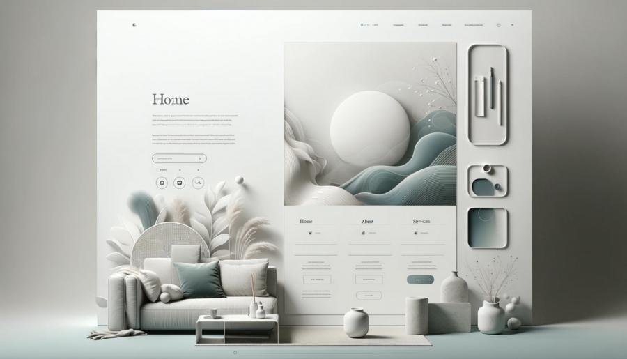
Once upon a time, in the dark and dreary days of the early internet, web design was a wild and untamed frontier. Flashing banners, dancing baby GIFs, and spinning "@" symbols roamed the land, free to assault our senses at every turn. But as we humans are wont to do, we began to evolve. We learned to wield fire, we invented the wheel, and we shrugged off the shackles of our overly cluttered digital surroundings.Enter minimalist web design - a sleek, clean, and oh-so-refreshing approach to presenting information on the World Wide Web. Gone are the days of being bombarded by obnoxious, seizure-inducing visuals. In their place, we find gentle whispers of color, typography that doesn't make us want to claw our eyes out, and - dare I say it - white space. Glorious, soothing, not-filled-with-unnecessary-garbage white space.
The Art of Decluttering: A Lesson in Zen
Minimalist design, my friends, is not just about making things look pretty. It's about creating a user experience that's as smooth as a baby's bottom and as calming as a tranquil ocean breeze. It's about providing the information your users need, without sending them into a blind rage over the sheer amount of clutter on the screen.- Embrace simplicity: Remember that you're not trying to win a prize for the most bells and whistles on a single page. Keep things clean, keep things basic, and focus on what really matters - the content.
- Whitespace is your friend: It's not there just to fill up the empty parts of your screen. Whitespace helps guide your users" eyes through the content, making it easier for them to absorb the information you're presenting.
- Choose your colors wisely: You're not trying to recreate the Sistine Chapel here. Stick to a limited color palette that's easy on the eyes and that complements your content, rather than distracting from it.
- Typography matters: Arial, Comic Sans, and Papyrus walk into a bar. The bartender says, "We don't serve your kind here." Choose a font that's legible, professional, and easy to read.
Less Is More: The Benefits of Minimalist Design
Now that you've got a basic grasp of minimalist design principles, let's explore the myriad benefits of this stripped-down approach to web design. Spoiler alert: people will love you for it.- Increased usability: When your site is clean and easy to navigate, users are more likely to find what they're looking for and to have a positive experience. Happy users are more likely to stick around and keep coming back for more.
- Faster page load times: With less clutter and fewer unnecessary elements, your site will load faster, which is a big plus in our ever-impatient, instant-gratification-loving society.
- Improved SEO: Minimalist design often translates to cleaner, more streamlined code. This can make your site more accessible to search engines, helping to boost your search rankings.
- Better mobile compatibility: With more and more people accessing the web via their smartphones and tablets, having a site that's easy to navigate on a smaller screen is crucial. Minimalist design lends itself well to this kind of adaptability.
Examples of Minimalist Masterpieces
Before you go rushing off to purge your website of all things unnecessary, let's take a moment to bask in the glory of some truly exceptional examples of minimalist design. These sites have managed to strike that delicate balance between form and function, proving that less is indeed more.- Apple: The masters of minimalism, Apple's website is a shining example of clean design and an intuitive user experience. It's like the digital equivalent of a crisp white button-down shirt - timeless and effortlessly stylish.
- Dropbox: Dropbox's minimalist approach to design doesn't just make their site easy to use - it also serves to reinforce their brand message of simplicity and ease of use.
- Medium: This blogging platform is all about putting the focus on the content, with a clean, uncluttered layout that's perfect for reading. It's like a refreshing, ice-cold drink on a sweltering summer day.
Embrace the Less Is More Philosophy in 2023 and Beyond
And there you have it, my friends - a veritable treasure trove of minimalist design wisdom. As we march boldly into 2023, let us cast off the shackles of our cluttered past and embrace a future where less truly is more. Let us create digital spaces that are not just visually appealing, but that offer a user experience that's as smooth as silk and as refreshing as a dip in a mountain stream.In the immortal words of Ludwig Mies van der Rohe, "less is more." Let that be your mantra as you navigate the treacherous waters of web design in 2023 and beyond.
Article kindly provided by designerviews.org
Latest Articles
- How Small Design Inconsistencies Slowly Erode Trust
- How Small Design Inconsistencies Slowly Erode Trust
- Why Banner Design Is Still One of the Most Effective Local Marketing Tools
- Designing for Impatient People, and Why That's a Good Thing
- Borrowing Film Planning Techniques for Better Graphic and Web Design
- Designing with Light Instead of Filters: How Atmosphere Shapes a Photograph
- The Scent Wardrobe Principle: Designing Your Fragrance Collection Like an Interior Space
- How Small Visual Details Change the Entire Mood of an Image
- Turning Everyday Lighting Into a Design Feature
- Designing Photo Albums That People Actually Revisit
- Designing Illusions: How Sliding Wardrobe Doors Can Visually Reshape a Room
- Fit Over Fashion Why Tailoring Matters More Than Trends for Formalwear
- Why Fast Websites Matter More Than Beautiful Ones When People Are Choosing Where to Eat
- When Product Photos Quietly Sabotage Online Sales
- When a Wedding Day Quietly Becomes Its Own Photographer
- Why Gilded Elements in Art Still Resonate Today
- Why Your Product Photos Should Tell a Story
- Crafting Interiors That Help Music Truly Come Alive
- Why Packaging Design Matters Even for Digital Products
- Color Palettes That Evolve: Creating Schemes That Shift With Time of Day, Mood, or User Context
- Architecture
- Graphic Design
- Web Design
- Industrial Design
- Interior Design
- Fashion Design
- Photography
- Product Design
- UI/UX Design
- Landscape Design
- Animation
- Industrial Engineering
- Packaging Design
- Branding and Identity Design
- Exhibit Design
- Advertising Design
- Typography
- Motion Graphics
- Sustainable Design
- User Research
- Fashion Merchandising
- Film and Video Production
- UX Writing
- Environmental Design
- Print Design
- Interaction Design
- Art Direction
- Textile Design
- Game Design
- Virtual Reality (VR) Design
- General Design Principles
- Event and Wedding Design