Retro Aesthetics in Modern Web Design: A Nostalgic Trip Down Pixelated Lane
The Allure of Yesteryear
As we hurtle through the digital age, mouths agape at the breakneck pace of technological innovation, we occasionally glance in the rearview mirror and catch glimpses of a simpler time. A time when web design was less about data-driven user engagement and more about making your GeoCities page look as gnarly as possible. Retro aesthetics have reared their pixelated heads in recent years, creeping into the modern design landscape with a sense of nostalgic charm.The resurgence of retro aesthetics in web design is not simply about nostalgia, however. Rather, it represents a response to the cookie-cutter designs and templates that have become all too common in the digital realm. How many sites have you visited recently that sport the same hero images, sticky headers, and "mobile-first" layouts? The answer, dear pixel pushers, is far too many.
Practical Magic: Tips for Incorporating Retro Aesthetics
So, how does one infuse a bit of retro magic into their web design projects without falling into the trap of cliché or sacrificing usability? Fear not, fellow time travelers, for I have prepared a handy list of tips to guide you on your journey through the annals of digital design history:- Typography: The liberal use of vintage typefaces and fonts is an easy way to transport your users through time. Steer clear of Helvetica and its ilk in favor of throwback classics like Cooper Black, Courier, or Futura.
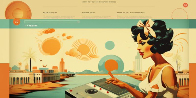
- Color Palette: Say goodbye to the soothing pastels of modern design, and hello to the vibrant, high-contrast hues of yesteryear. Think bright neons, warm earth tones, and bold primary colors.
- Textures and Patterns: Give your site some tactile appeal with the use of pixelated textures, scan lines, and geometric patterns. Don't be afraid to get a little messy with it - after all, the 90s were all about grunge, baby!
- Imagery: We all remember the days of pixel art and low-resolution photography, and incorporating these visual elements into your design can lend it a distinctly retro vibe. Embrace the 8-bit, my friends.
- Navigation: While it's important to maintain usability and functionality, consider experimenting with unconventional navigation menus and buttons that harken back to the early days of the web. Just don't forget to include a "skip intro" option for those less inclined to indulge in your digital time warp.
- Animation: Remember the dancing hamsters and spinning "under construction" gifs that populated the web of yore? While I'm not advocating a return to these particular abominations, tasteful and restrained use of animation can add a playful, retro touch to your design.
Noteworthy Examples of Retro Web Design
Looking for inspiration? Look no further than these contemporary sites that have expertly integrated retro aesthetics into their designs:- Artsy - This online art platform combines a sleek, modern design with subtle nods to the past, such as their iconic serif logo and frequent use of vintage typefaces.
- Space150 - Digital agency Space150's site features a moody, atmospheric background that recalls the grainy depths of a CRT television screen. Their logo, too, is an ode to the pixelated icons of old.
- Mozilla Firefox - The Mozilla Firefox download page features a delightful throwback to Windows 95-style interface elements, complete with pixelated icons and classic window buttons.
- Nintendo NES Classic Edition - Created to promote the re-release of their classic gaming console, Nintendo's NES Classic Edition site is a veritable feast of retro design elements, including 8-bit graphics, vintage fonts, and an eye-popping color palette.
The Delicate Balance of Past and Present
While the allure of retro aesthetics is undeniable, it's important to remember that design is about more than just aesthetics. A successful web design must strike a balance between form and function, and it's crucial not to sacrifice the latter in the pursuit of nostalgic expression.As you embark on your own retro-fueled design adventures, remember to keep usability and accessibility at the forefront of your mind. In the words of the great design philosopher Terence Conran, "Good design is probably 98% common sense, 2% aesthetics." And as we all know, common sense is timeless.
Latest Articles
- Why Banner Design Is Still One of the Most Effective Local Marketing Tools
- Designing for Impatient People, and Why That's a Good Thing
- Borrowing Film Planning Techniques for Better Graphic and Web Design
- Designing with Light Instead of Filters: How Atmosphere Shapes a Photograph
- The Scent Wardrobe Principle: Designing Your Fragrance Collection Like an Interior Space
- How Small Visual Details Change the Entire Mood of an Image
- Turning Everyday Lighting Into a Design Feature
- Designing Photo Albums That People Actually Revisit
- Designing Illusions: How Sliding Wardrobe Doors Can Visually Reshape a Room
- Fit Over Fashion Why Tailoring Matters More Than Trends for Formalwear
- Why Fast Websites Matter More Than Beautiful Ones When People Are Choosing Where to Eat
- When Product Photos Quietly Sabotage Online Sales
- When a Wedding Day Quietly Becomes Its Own Photographer
- Why Gilded Elements in Art Still Resonate Today
- Why Your Product Photos Should Tell a Story
- Crafting Interiors That Help Music Truly Come Alive
- Why Packaging Design Matters Even for Digital Products
- Color Palettes That Evolve: Creating Schemes That Shift With Time of Day, Mood, or User Context
- Exploring Subtle Details Found in Quality Swiss Timepieces
- How Adaptive Cabin Environments Let Chauffeured Executives Shift Effortlessly Between Rest and Focus
- Architecture
- Graphic Design
- Web Design
- Industrial Design
- Interior Design
- Fashion Design
- Photography
- Product Design
- UI/UX Design
- Landscape Design
- Animation
- Industrial Engineering
- Packaging Design
- Branding and Identity Design
- Exhibit Design
- Advertising Design
- Typography
- Motion Graphics
- Sustainable Design
- User Research
- Fashion Merchandising
- Film and Video Production
- UX Writing
- Environmental Design
- Print Design
- Interaction Design
- Art Direction
- Textile Design
- Game Design
- Virtual Reality (VR) Design
- General Design Principles
- Event and Wedding Design