The Art of Menu Design in Restaurants
An Ode to the Humble Menu
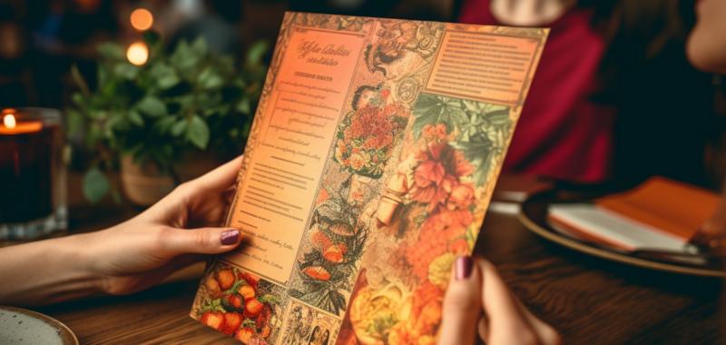
With so much focus given to crafting culinary masterpieces, it's easy to forget about the little piece of paper that presents them. Yes, I'm talking about the humble menu - a restaurant's unsung hero, the Cinderella of dining, the stage upon which dishes pirouette to entice, delight, and ensnare unsuspecting diners. The menu deserves our respect, and yet, it often goes unnoticed or is treated like an afterthought. Today, we remedy that oversight by celebrating the art of menu design.The Psychology of Choice
The menu is a powerful tool that can shape our dining experience in subtle yet profound ways. It whispers sweet nothings in our ears, seducing us into making choices we might not have otherwise considered. It gently nudges us to splurge on the lobster when we intended to stick with the salad. How does it do this, you ask? By employing the dark arts of psychology.- Layout: We may like to think of ourselves as rational beings, but we are often slaves to our eyes. A well-designed menu will guide our eyes to specific items through the use of boxes, lines, and other graphic elements. And, like moths to a flame, we are drawn to these items and more likely to order them.
- Descriptions: If a picture is worth a thousand words, a well-written menu description is worth at least a hundred drooling mouths. Descriptive language can conjure up mouthwatering images and awaken dormant taste buds, making it much more difficult to resist temptation.
- Price Anchoring: Ah, the cunning art of price anchoring - the act of placing a higher-priced item near a more reasonably priced one to make the latter seem like a bargain. This psychological trickery can make us feel like we're getting a steal when, in fact, we're playing right into the hands of the menu designer.
The Power of Typography
Typography is like the wardrobe of the menu world. Just as we wouldn't attend a formal ball in sweatpants, we should never dress our menus in Comic Sans. Fonts matter, my friends. They can set the tone, evoke emotions, and even influence our perception of taste.For example, studies have shown that diners perceive food to taste better when presented in a font that they associate with elegance and sophistication. Conversely, a cheap or poorly chosen font can leave a bad taste in their mouths before they've even taken a bite. The power of typography is not to be underestimated.
Color Me Hungry
Did you know that colors can affect our appetite? It's true! Warm colors like red, orange, and yellow are said to stimulate the appetite, while cool colors like blue and green can have the opposite effect.Now, I'm not suggesting that you paint your menu the color of a ripe tomato, but it's worth considering how color choices can create a certain mood and subtly encourage diners to order more. After all, as any good magician knows, it's all about misdirection.
Size Matters
When it comes to menus, bigger is not always better. A menu that is too large can be unwieldy and make it difficult for diners to navigate. On the other hand, a menu that is too small can be uninviting and leave diners feeling overwhelmed by choice. The key is to strike a balance - to create a menu that is both functional and visually appealing.One popular solution is the use of thematic sections, which can help to break up the menu and make it more manageable. This could be as simple as dividing the menu into starters, mains, and desserts, or it could involve more creative categories like "From the Land," "From the Sea," and "From the Garden."
A Picture Is Worth a Thousand Calories
Ah, the age-old debate: to include photos of the food on the menu or not? While some may argue that photos cheapen the dining experience, others contend that they can be a helpful tool for visual learners or those with language barriers. Ultimately, it comes down to personal preference and the identity of the restaurant.If you do decide to include photos, it's crucial that they are high-quality and accurately represent the dishes. There's nothing worse than a grainy, sad-looking photo of a dish that, in reality, is a work of culinary art.
In Conclusion: It's All in the Details
Just as a symphony is made up of countless individual notes, a successful restaurant experience is the culmination of many small details, and the menu is no exception. By considering the psychology of choice, the power of typography, the influence of color, the importance of size, and the use of images, we can elevate the humble menu to a true work of art - a gastronomic guide that not only informs but also entices, delights, and bewitches the senses.So, the next time you find yourself perusing a menu, take a moment to appreciate the artistry and thought that has gone into its design. Bon appétit!
Article kindly provided by designerviews.org
Latest Articles
- The Quiet Design Details That Make Wedding Memories Feel More Personal
- The Psychology of Ceiling Height: How Vertical Space Changes the Way We Feel
- The Hidden Power of Product Demonstrations: Why Showing Beats Telling
- Beyond Family Portraits: Unexpected Photos That Make Stunning Wall Art
- Designing for Trust: The Hidden Visual Signals That Shape First Impressions
- Why Banner Design Is Still One of the Most Effective Local Marketing Tools
- Designing for Impatient People, and Why That's a Good Thing
- Borrowing Film Planning Techniques for Better Graphic and Web Design
- Designing with Light Instead of Filters: How Atmosphere Shapes a Photograph
- The Scent Wardrobe Principle: Designing Your Fragrance Collection Like an Interior Space
- How Small Visual Details Change the Entire Mood of an Image
- Turning Everyday Lighting Into a Design Feature
- Designing Photo Albums That People Actually Revisit
- Designing Illusions: How Sliding Wardrobe Doors Can Visually Reshape a Room
- Fit Over Fashion Why Tailoring Matters More Than Trends for Formalwear
- Why Fast Websites Matter More Than Beautiful Ones When People Are Choosing Where to Eat
- When Product Photos Quietly Sabotage Online Sales
- When a Wedding Day Quietly Becomes Its Own Photographer
- Why Gilded Elements in Art Still Resonate Today
- Why Your Product Photos Should Tell a Story
- Architecture
- Graphic Design
- Web Design
- Industrial Design
- Interior Design
- Fashion Design
- Photography
- Product Design
- UI/UX Design
- Landscape Design
- Animation
- Industrial Engineering
- Packaging Design
- Branding and Identity Design
- Exhibit Design
- Advertising Design
- Typography
- Motion Graphics
- Sustainable Design
- User Research
- Fashion Merchandising
- Film and Video Production
- UX Writing
- Environmental Design
- Print Design
- Interaction Design
- Art Direction
- Textile Design
- Game Design
- Virtual Reality (VR) Design
- General Design Principles
- Event and Wedding Design