The Importance of White Space in Design
What the Blank is White Space, Anyway?
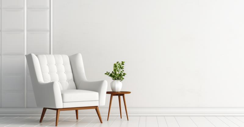
White space, also known as negative space, is a bit like the air we breathe; it's everywhere and essential, yet often ignored. In design, it's the empty areas surrounding the elements on a page (or screen). It's not always white, mind you, but that's a quibble for another day. The point is, without white space, everything would be just one big, chaotic mess, like a fraternity house after a wild party. And nobody wants to live in that design nightmare.Give Me Room to Breathe!
Nobody likes feeling cramped, whether it's in a crowded subway car or on a poorly designed webpage. White space gives designs room to breathe, allowing visual elements to relax and stretch out. It's like a yoga class for your design, with sans-serif fonts doing downward dog and images luxuriating in a deep, restorative shavasana.White space is also essential for readability and comprehension. If text and images are squished together like sardines in a can, our brains have a harder time processing the information. With generous white space, our brains can savor each item, like a fine wine or a juicy steak, making it easier to digest and retain the information. And who doesn't want that?
Hey, Look Over Here!
White space is the ultimate attention-grabber. It's like a giant neon sign screaming, "Look at me!" (without the visual migraine, of course). By strategically placing white space around key elements, such as headlines or calls-to-action, you can draw your viewers" attention right where you want it. It's like a magician's sleight of hand, without the cheesy theatrics or ridiculous outfits.Consider, for example, the iconic Apple ads, showcasing sleek gadgets floating within an ocean of luxurious white space. The result is elegant and seductive, whispering, "Buy me, you sexy minimalist, you."
Balance, Grasshopper, Balance
Too much of a good thing can be bad, even when it comes to white space. In "Goldilocks and the Three Bears" of design, you want to find a balance that's juuust right. Too little white space and your design feels cramped and chaotic, like the aforementioned fraternity house. But too much white space, and it might feel unfinished or empty, like a millionaire's McMansion with no furniture.Finding the right balance is key to creating a visually appealing design that effectively communicates your message. Keep in mind, though, that what works for one project might not work for another. Like a fine chef, you must adjust the recipe to suit the audience's taste buds.
The Illusion of White Space
White space need not always be an actual empty space on the page. It can also be an illusion, created by using elements like lines, borders, or shadows. It's like the magician who makes the Statue of Liberty disappear, only to have it reappear moments later. This technique can come in handy when you need to delineate sections or create a clear hierarchy, without resorting to visual clutter.A Few Tips from a Design Rebel
Now that you're a budding white space aficionado (or at least no longer completely clueless), here are a few tips to help you wield your newfound power:- Start with a strong grid: A solid grid structure is like the foundation of a sturdy house - it keeps everything standing and looking good. By adhering to a grid, you can ensure consistency and create a harmonious balance of white space throughout your design.
- Break the rules (sometimes): Once you've mastered the art of white space, feel free to break the rules now and then. Intentionally disregarding the grid or using unconventional amounts of white space can create a bold, unexpected look that grabs attention. Just remember, with great power comes great responsibility.
- Think 3D: When considering white space, think beyond just the top, bottom, and sides of elements. Consider how elements interact with one another, both horizontally and vertically, to create a sense of depth and cohesion.
- Don't fear the fold: In the digital realm, many designers worry about cramming everything "above the fold" - the portion of the webpage that's visible without scrolling. But it's okay to let your design breathe, even if it means your audience has to do a little scrolling. After all, they've got fingers, and they know how to use 'em.
- Experiment and iterate: Finding the perfect balance of white space is a bit like taming a wild beast - it takes patience, skill, and a willingness to experiment. Don't be afraid to try different approaches and refine your design until you achieve white space nirvana.
Article kindly provided by designerviews.org
Latest Articles
- The Quiet Design Details That Make Wedding Memories Feel More Personal
- The Psychology of Ceiling Height: How Vertical Space Changes the Way We Feel
- The Hidden Power of Product Demonstrations: Why Showing Beats Telling
- Beyond Family Portraits: Unexpected Photos That Make Stunning Wall Art
- Designing for Trust: The Hidden Visual Signals That Shape First Impressions
- Why Banner Design Is Still One of the Most Effective Local Marketing Tools
- Designing for Impatient People, and Why That's a Good Thing
- Borrowing Film Planning Techniques for Better Graphic and Web Design
- Designing with Light Instead of Filters: How Atmosphere Shapes a Photograph
- The Scent Wardrobe Principle: Designing Your Fragrance Collection Like an Interior Space
- How Small Visual Details Change the Entire Mood of an Image
- Turning Everyday Lighting Into a Design Feature
- Designing Photo Albums That People Actually Revisit
- Designing Illusions: How Sliding Wardrobe Doors Can Visually Reshape a Room
- Fit Over Fashion Why Tailoring Matters More Than Trends for Formalwear
- Why Fast Websites Matter More Than Beautiful Ones When People Are Choosing Where to Eat
- When Product Photos Quietly Sabotage Online Sales
- When a Wedding Day Quietly Becomes Its Own Photographer
- Why Gilded Elements in Art Still Resonate Today
- Why Your Product Photos Should Tell a Story
- Architecture
- Graphic Design
- Web Design
- Industrial Design
- Interior Design
- Fashion Design
- Photography
- Product Design
- UI/UX Design
- Landscape Design
- Animation
- Industrial Engineering
- Packaging Design
- Branding and Identity Design
- Exhibit Design
- Advertising Design
- Typography
- Motion Graphics
- Sustainable Design
- User Research
- Fashion Merchandising
- Film and Video Production
- UX Writing
- Environmental Design
- Print Design
- Interaction Design
- Art Direction
- Textile Design
- Game Design
- Virtual Reality (VR) Design
- General Design Principles
- Event and Wedding Design