The Unhinged World of Advertising Design
Waking the Beast: The Power of the Billboard
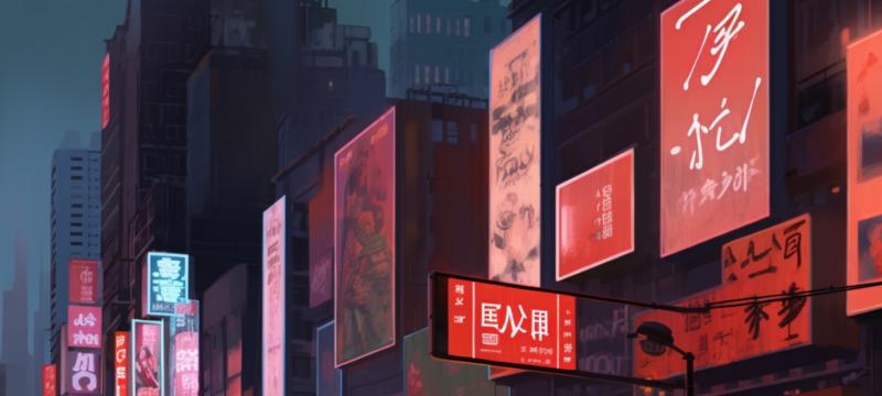
Ah, the billboard. That massive, looming beast that has become an ever-present part of our lives, silently screaming at us from the side of the road, interrupting the peaceful view of our commutes with its desperate attempts to sell us things. The art of advertising design, you see, is not just about creating aesthetically pleasing visuals - it's about waking the slumbering beast, the consumer, from their daily trance and forcing them to pay attention to the message being presented.And, if we're going to be honest with ourselves, it's not just billboards that are guilty of this affront. The world of advertising design is a wild, unruly place, filled with a vast array of visual stimuli all vying for our attention. TV commercials, print ads, digital banners - each one is a calculated and artful attack on our senses, a blitzkrieg of colour, typography, and imagery designed to capture our gaze, inspire our desires, and, ultimately, separate us from our hard-earned money.
The Siren Song of Advertising Typography
Imagine, if you will, a world without typography. A world where the written word is replaced with hastily scribbled symbols, devoid of nuance and meaning. A world where the tools of communication crumble beneath the weight of a million haphazard pen strokes. It's a bleak vision, isn't it?Now imagine the world of advertising design without typography. A cacophony of images, clashing and jostling for attention, unanchored and adrift without the tether of carefully crafted text. The role of typography in advertising design is a vital one, for it serves not only as a means of communication, but as a force capable of imbuing a design with a distinct and unmistakable personality. Skilled advertising designers recognize the power of type and wield it in a manner akin to the conductor of a grand orchestra, guiding the viewer's eyes from one visual element to another, creating harmony amidst the chaos.
- Helvetica: Like a well-tailored suit, Helvetica is the go-to font for those seeking a clean, modern, and professional look. Simple, unassuming, and versatile, it's the James Bond of the font world - always cool under pressure and ready for action.
- Comic Sans: The font we all love to hate, but let's be honest - it has its place. That place is not in advertising design, however. Comic Sans is the font equivalent of a clown car - cramped, chaotic, and better suited for entertaining children than conveying a serious message.
- Times New Roman: Ah, the trusty workhorse of the font world. It's dependable, yes, but it's also a bit... bland. Times New Roman is the advertising equivalent of a glass of lukewarm tap water - it'll quench your thirst, but it won't leave you feeling satisfied.
Decoding the Visual Language
One could argue that the true art of advertising design lies not in the creation of striking visuals, but in the ability to craft a visual language that resonates with the viewer on a deeper, more subconscious level. It's like a secret code hidden within the design, a code that, when deciphered, reveals a message that speaks to the heart of the viewer, bypassing the rational mind and tapping directly into their emotions, their desires, their dreams.Consider the iconic Coca-Cola logo, with its flowing script and vibrant red colour. It's a design that transcends mere aesthetics and taps into something deeper, something inherently human. The curves of the script evoke a sense of warmth and nostalgia, while the red colour is a powerful symbol of passion, energy, and vitality. Together, these elements create a visual language that speaks to the viewer's emotions, evoking feelings of comfort, excitement, and a longing for simpler times.
This, my friends, is the true power of advertising design - the ability to penetrate the human psyche, to burrow deep within the recesses of our minds and plant a seed that blossoms into a desire, a need, an insatiable craving for whatever product or service the design whispers to us through its carefully crafted visual language.
Conclusion: The Triumph and Tragedy of Advertising Design
We've journeyed through the unhinged world of advertising design, exploring its many facets and delving into the depths of its power to influence our thoughts, feelings, and actions. We've awakened the beast of the billboard, delved into the siren song of typography, and decoded the visual language that lies hidden within the folds of advertising's many layers.And in doing so, we've come face to face with the triumph and tragedy of this strange, beautiful, and occasionally maddening art form. The triumph lies in the fact that the art of advertising design has the power to shape our world, to influence our decisions, and to inspire us to dream. The tragedy, however, is that this power is so often wielded in the service of selling us things - things we may not need, things we may not even want, but things we are nevertheless compelled to desire through the persuasive and insidious art of advertising design.
But perhaps there is hope. Perhaps, as we continue to explore and understand the complex relationship between advertising design and the human psyche, we can find a way to harness this power not just for the purposes of commerce, but for the betterment of our lives, our communities, and our world. A lofty goal, perhaps, but a worthy one nonetheless.
Article kindly provided by designerviews.org
Latest Articles
- The Quiet Design Details That Make Wedding Memories Feel More Personal
- The Psychology of Ceiling Height: How Vertical Space Changes the Way We Feel
- The Hidden Power of Product Demonstrations: Why Showing Beats Telling
- Beyond Family Portraits: Unexpected Photos That Make Stunning Wall Art
- Designing for Trust: The Hidden Visual Signals That Shape First Impressions
- Why Banner Design Is Still One of the Most Effective Local Marketing Tools
- Designing for Impatient People, and Why That's a Good Thing
- Borrowing Film Planning Techniques for Better Graphic and Web Design
- Designing with Light Instead of Filters: How Atmosphere Shapes a Photograph
- The Scent Wardrobe Principle: Designing Your Fragrance Collection Like an Interior Space
- How Small Visual Details Change the Entire Mood of an Image
- Turning Everyday Lighting Into a Design Feature
- Designing Photo Albums That People Actually Revisit
- Designing Illusions: How Sliding Wardrobe Doors Can Visually Reshape a Room
- Fit Over Fashion Why Tailoring Matters More Than Trends for Formalwear
- Why Fast Websites Matter More Than Beautiful Ones When People Are Choosing Where to Eat
- When Product Photos Quietly Sabotage Online Sales
- When a Wedding Day Quietly Becomes Its Own Photographer
- Why Gilded Elements in Art Still Resonate Today
- Why Your Product Photos Should Tell a Story
- Architecture
- Graphic Design
- Web Design
- Industrial Design
- Interior Design
- Fashion Design
- Photography
- Product Design
- UI/UX Design
- Landscape Design
- Animation
- Industrial Engineering
- Packaging Design
- Branding and Identity Design
- Exhibit Design
- Advertising Design
- Typography
- Motion Graphics
- Sustainable Design
- User Research
- Fashion Merchandising
- Film and Video Production
- UX Writing
- Environmental Design
- Print Design
- Interaction Design
- Art Direction
- Textile Design
- Game Design
- Virtual Reality (VR) Design
- General Design Principles
- Event and Wedding Design