Exploring Subtle Details Found in Quality Swiss Timepieces
 Opening a watch box can feel a bit like lifting the lid on a magician's prop—there's the obvious showmanship, and then there's the trick happening quietly where few people ever look. The logo usually hogs the spotlight, but the real clues about quality sit elsewhere, waiting for someone curious enough to notice.
Case Finishing: The First Whisper of Craft
Run a fingertip along a well-finished case and you'll sense the difference instantly. Edges that transition from brushed to polished surfaces without abrupt steps hint at hours of handiwork rather than a machine's quick pass. If the case feels like it could double as a cheese grater, quality was probably not the driving concern.When manufacturers invest in surface treatments, the aim isn't just shine—it's durability, refinement, and consistency. Brushing should have even grain, not the accidental "abstract expressionism" pattern left by hurried tooling. Polished sections should be mirror-like without the funhouse reflections that make your wrist look like it's been through a distortion filter. These details influence not just aesthetics but how the watch ages over time.
Movement Bridges: Architecture in Miniature
Pop open the back of a finely built watch—ideally with the help of a professional unless you enjoy voiding warranties—and you'll find structural elements known as bridges. They're the supporting architecture of the movement, and their design gives away a watchmaker's priorities faster than any marketing tagline ever could.Some bridges feature Geneva stripes, anglage (hand-polished bevels), or perlage. None of these affect accuracy on their own, yet they reveal the level of care invested. A movement with sharp, clean bevels and neatly executed decoration suggests someone labored over the details. A movement that looks like it was engraved by a caffeinated squirrel suggests the opposite.
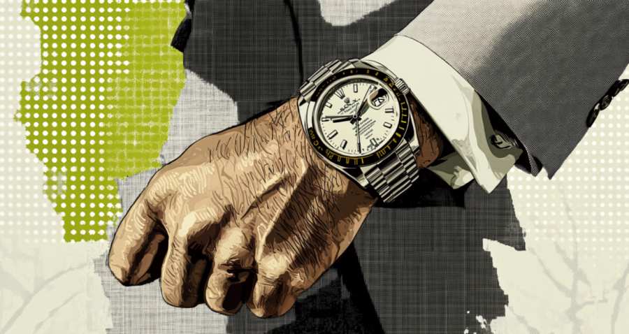
Dial Fonts and the Language of Precision
Fonts on a dial do more than convey numbers—they telegraph intent. Crisp printing, evenly applied lume, and spacing that doesn't require squinting to understand can elevate a dial from functional to quietly excellent.A fine dial respects alignment. Numerals shouldn't appear to lean like they're trying to escape the watch. The text should be sharp enough that you could almost read it with a weak magnifying glass without feeling mocked by the typeface. Even the color consistency of inks matters; mismatched hues can undermine an otherwise elegant design.
If a brand takes typography seriously, it's a sign they likely take the rest just as seriously. Watchmakers who fuss over the curvature of a "3" are usually the same ones who obsess over tolerances that keep a movement running smoothly.
Hands, Indices, and the Art of Small Things
The hands and indices often reveal the quiet truth about a watch's identity. High-quality hands are sharply cut, evenly coated, and free of rough edges. Lower-quality hands, on the other hand, sometimes resemble miniature kitchen utensils that survived an unfortunate run-in with a belt sander.Indices should be applied with care rather than glued on with the enthusiasm of someone decorating a school project. Their alignment matters—a misaligned index might only be off by a fraction of a millimeter, but once you notice it, the watch will forever look like it's slowly drifting out of tune with reality.
Straps and Bracelets: The Unsung Heroes
A watch can only look as good as what holds it onto your wrist. A solid bracelet with properly machined links feels substantial without being clunky. Rattling bracelets, however, make it sound like your wrist has taken up percussion.Well-made leather straps age gracefully, developing character rather than cracking like poorly maintained upholstery. Even the stitching tells a story: precise, consistent stitches reflect thoughtful design, while erratic ones give off the energy of someone rushing to clock out early.
- Check the articulation of bracelet links—smooth flex is a good sign.
- Look for even stitching on leather and fabric straps.
- Inspect clasp operation; a reliable clasp shouldn't feel like a puzzle box.
When Hidden Details Outshine Logos
What truly separates a well-built watch from one that relies on a loud brand name is usually found beneath the surface. It's the consistency of finishing, the care in assembly, the confidence in engineering. These characteristics don't scream for attention; they wait politely for someone patient enough to notice.There's a quiet pleasure in discovering these details yourself. It turns buying a watch into more than a transaction—it becomes an exploration. Instead of relying on prestige or popularity, understanding these features allows you to judge quality on its own merits. And it might save you from paying premium prices for a watch whose most impressive feature is its marketing budget.
Time Well Spent
Appreciating a watch's hidden strengths is less about becoming a horological detective and more about paying attention to the small signals that hint at genuine craftsmanship. Once you start noticing these things, it's difficult to unsee them, and the world of watches becomes richer for it.Quality isn't always flashy. Sometimes it's a bevel polished to perfection, a font chosen with care, or a bracelet that feels like it belongs on your wrist rather than clinging desperately to it. These understated traits make a watch worth wearing, admiring, and perhaps one day passing on—ideally without the rattling bracelet.
Article kindly provided by watchesofhenleyst.co.uk
Latest Articles
- The Quiet Design Details That Make Wedding Memories Feel More Personal
- The Psychology of Ceiling Height: How Vertical Space Changes the Way We Feel
- The Hidden Power of Product Demonstrations: Why Showing Beats Telling
- Beyond Family Portraits: Unexpected Photos That Make Stunning Wall Art
- Designing for Trust: The Hidden Visual Signals That Shape First Impressions
- Why Banner Design Is Still One of the Most Effective Local Marketing Tools
- Designing for Impatient People, and Why That's a Good Thing
- Borrowing Film Planning Techniques for Better Graphic and Web Design
- Designing with Light Instead of Filters: How Atmosphere Shapes a Photograph
- The Scent Wardrobe Principle: Designing Your Fragrance Collection Like an Interior Space
- How Small Visual Details Change the Entire Mood of an Image
- Turning Everyday Lighting Into a Design Feature
- Designing Photo Albums That People Actually Revisit
- Designing Illusions: How Sliding Wardrobe Doors Can Visually Reshape a Room
- Fit Over Fashion Why Tailoring Matters More Than Trends for Formalwear
- Why Fast Websites Matter More Than Beautiful Ones When People Are Choosing Where to Eat
- When Product Photos Quietly Sabotage Online Sales
- When a Wedding Day Quietly Becomes Its Own Photographer
- Why Gilded Elements in Art Still Resonate Today
- Why Your Product Photos Should Tell a Story
- Architecture
- Graphic Design
- Web Design
- Industrial Design
- Interior Design
- Fashion Design
- Photography
- Product Design
- UI/UX Design
- Landscape Design
- Animation
- Industrial Engineering
- Packaging Design
- Branding and Identity Design
- Exhibit Design
- Advertising Design
- Typography
- Motion Graphics
- Sustainable Design
- User Research
- Fashion Merchandising
- Film and Video Production
- UX Writing
- Environmental Design
- Print Design
- Interaction Design
- Art Direction
- Textile Design
- Game Design
- Virtual Reality (VR) Design
- General Design Principles
- Event and Wedding Design