Hues That Hug: Creating Calm, Focus, and Joy Through Sensory Colour
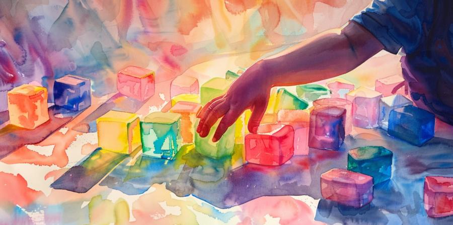 Kids don't read colour like adults do; they drink it. Hand a toddler something neon and you'll see a small sun worshipper; hand them muted slate and you'll see a museum curator. Designers of sensory toys have to choreograph that appetite with care, because hue can either sharpen attention or turn the room into a carnival at closing time.
Hue Sets the Mood
Different shades tug at different levers of the nervous system. Soft blues and greens tend to slow heart rate and invite longer engagement, while hot reds and electric pinks spike alertness and can tip into agitation if they monopolise the scene. It's not dogma; it's probability. Children vary, but trends help you rig the odds in favour of focus. A useful rule: let energising colours appear in small, high-value details, and keep large surfaces in calmer tones. The toy should greet the senses, not shout them down.Contrast Is Rocket Fuel
Contrast helps young eyes find edges, decode shapes, and stick with a task. High contrast on a key feature—say, a black-and-white ring around a button—acts like a spotlight. But global, wall-to-wall contrast makes everything compete for attention. Aim for **hierarchy**: one element owns the headline, the others play backup. Designers can test this by squinting at prototypes or viewing them in grayscale; if the hierarchy still reads, the contrast is probably right.Glow, Don't Glare
Light is a powerful co-star in sensory play. Diffused glow calms; pinpoint glare startles. LEDs behind frosted housings create a soft aura that widens a child's visual comfort zone. Flicker rates matter too: low-quality strobing can exhaust even an adult, let alone a six-year-old mid-meltdown. Think of glow as the exhale of the toy—slow, regular, predictable.Practical Palette Building
Designers don't need a degree in colour theory pinned above the workbench; a pocketable palette logic works:- Pick a **base** of two calming hues for large areas.
- Add one **accent** for calls to action—buttons, toggles, edges.
- Reserve one **surprise** colour for discovery moments inside lids or under flaps.
- Keep whites slightly warm to avoid clinical chill.
- Test palettes under daylight, warm indoor bulbs, and dim night lighting.
When Colour Meets Touch
Colour never works alone. A lemon-zest yellow on a scratchy plastic will feel harsher than the same yellow on a soft-touch silicone. Pair cool hues with smoother textures to extend calm; pair hotter hues with grippier textures to keep excitement from slipping into chaos. Children will forgive almost any colour if the texture is pleasant; they will not forgive sticky-shiny plastic that squeaks like a shoe in a church aisle.Colour as Communication
Colour operates as one of the first languages children learn. A crimson blob doesn't merely say "red"; it announces *energy approaching*. Pale blue whispers *rest*. Designers of sensory toys exploit this primal lexicon to signal safety or action before a child has any grasp of words. Yet the same palette that soothes one child can overstimulate another. What looks cheerful to adults can feel tyrannical to a nervous system still learning its thresholds.In prototype labs, designers sometimes observe the same toy in different lighting and with different children. One laughs, another winces. These moments are small masterclasses in emotional calibration: how colour can either welcome or repel. Good sensory design accepts that colour is not decoration—it's an interface with the child's inner weather.
Designing for Emotional Range
The most successful sensory toys behave a little like good companions—they know when to chatter and when to listen. This is achieved not through circuitry, but colour restraint. A designer might create a sequencing game that begins in lively yellows and gradually transitions to soft greens as the play winds down. The toy itself becomes an emotional regulator, teaching rhythm and rest without preaching it.It's easy to assume more colour equals more fun. It doesn't. Overly saturated toys can behave like caffeine for the eyes, leaving kids restless or irritable. Balanced palettes mimic nature: short bursts of intensity—think ladybirds, coral reefs—set against calmer grounds. A well-tuned palette keeps the sensory field dynamic without turning it into a shouting match.
Testing the Palette in Motion
Static colour tests are liars. A block of orange might feel friendly on a screen, but flash it on a spinning toy and you've got an inadvertent alarm signal. Motion exaggerates hue. Designers need to test toys in action—rotating, flashing, tumbling—to see how colours interact when kinetic. The goal is rhythm, not frenzy.Some studios even invite parents and occupational therapists to watch testing sessions. They note the child's body language: lingering gaze versus flinch, laugh versus freeze. These reactions become data. Colour choices are then adjusted the way a composer adjusts tempo, chasing emotional coherence rather than mere prettiness.
A Bit of Glow for Good Measure
Backlit toys and fibre-optic designs introduce another layer: colour as atmosphere. A dim glow can signal bedtime, a pulsating fade can guide breathing. Yet too much luminosity can overrun the senses—turning what should calm into an accidental rave. The trick is moderation and purpose. Light should *support* play, not hijack it.Some of the cleverest modern sensory designs use indirect glow—colour reflected off walls, or through translucent silicone. The effect is subtle: a shimmer of mood rather than a command for attention. Think of it as the difference between a candle and a car headlight.
A Hue-Morous Ending
Children often teach designers humility. They'll ignore the colour theory, the planned emotional arc, the painstakingly balanced contrasts—and fall in love with the one feature the designer added at 2 a.m. as an afterthought. But that's the point. Colour doesn't obey theory entirely because emotion doesn't either. The real craft lies in designing toys that invite exploration without demanding it, that stimulate curiosity without chasing it around the room with a net.Colour that truly speaks without words doesn't shout its message; it hums it. When it works, you don't see a toy—you feel it. And in that silent, glowing conversation between hue and heartbeat, a small person learns the quiet grammar of calm.
Article kindly provided by playinc.co.uk
Latest Articles
- The Quiet Design Details That Make Wedding Memories Feel More Personal
- The Psychology of Ceiling Height: How Vertical Space Changes the Way We Feel
- The Hidden Power of Product Demonstrations: Why Showing Beats Telling
- Beyond Family Portraits: Unexpected Photos That Make Stunning Wall Art
- Designing for Trust: The Hidden Visual Signals That Shape First Impressions
- Why Banner Design Is Still One of the Most Effective Local Marketing Tools
- Designing for Impatient People, and Why That's a Good Thing
- Borrowing Film Planning Techniques for Better Graphic and Web Design
- Designing with Light Instead of Filters: How Atmosphere Shapes a Photograph
- The Scent Wardrobe Principle: Designing Your Fragrance Collection Like an Interior Space
- How Small Visual Details Change the Entire Mood of an Image
- Turning Everyday Lighting Into a Design Feature
- Designing Photo Albums That People Actually Revisit
- Designing Illusions: How Sliding Wardrobe Doors Can Visually Reshape a Room
- Fit Over Fashion Why Tailoring Matters More Than Trends for Formalwear
- Why Fast Websites Matter More Than Beautiful Ones When People Are Choosing Where to Eat
- When Product Photos Quietly Sabotage Online Sales
- When a Wedding Day Quietly Becomes Its Own Photographer
- Why Gilded Elements in Art Still Resonate Today
- Why Your Product Photos Should Tell a Story
- Architecture
- Graphic Design
- Web Design
- Industrial Design
- Interior Design
- Fashion Design
- Photography
- Product Design
- UI/UX Design
- Landscape Design
- Animation
- Industrial Engineering
- Packaging Design
- Branding and Identity Design
- Exhibit Design
- Advertising Design
- Typography
- Motion Graphics
- Sustainable Design
- User Research
- Fashion Merchandising
- Film and Video Production
- UX Writing
- Environmental Design
- Print Design
- Interaction Design
- Art Direction
- Textile Design
- Game Design
- Virtual Reality (VR) Design
- General Design Principles
- Event and Wedding Design