How Monochrome Shifts Perception in Wildlife and Landscape Imagery
 Some photographs don't need the drama of a flaming sunset or the absurdly blue plumage of a tropical bird. Strip away the color, and suddenly the focus turns elsewhere—lines, textures, even the awkward tilt of a wildebeest's head. Monochrome isn't about denying reality; it's about rearranging it for emphasis. Black and white imagery does something slightly mischievous with our brains: it insists we look harder, without the dopamine hit of color distraction.
Form Without the Noise
Wildlife and landscapes carry natural ornamentation—feathers, fur, rocks, roots—that often fight for our attention when rendered in color. A zebra in the savanna? Magnificent, yes, but in full color the background grasses and sky want their share of the limelight. Convert it to monochrome, and suddenly the stripes perform a solo act. Lines intersect, curves clash, and rhythm takes over. It's geometry masquerading as biology.With landscapes, monochrome highlights topography more than climate. A ridge line becomes an ink drawing. Valleys are no longer just green or brown—they're carved shadows. The absence of color clarifies shape, which is why black and white images feel almost architectural. You can almost measure them with a ruler, though that would be an odd way to enjoy a photograph.
Texture Takes the Stage
If form provides the scaffolding, texture brings the flesh. A lion's mane in monochrome looks less like a golden halo and more like an unruly collection of wiry ropes. Rocks, once blandly beige, suddenly appear as cracked parchment. Snow loses its polite whiteness and reveals subtler grain, tracks, and dents.Color has a habit of softening everything into palatability. Monochrome, by contrast, is brutally honest. It shows wrinkles, creases, scratches. It will happily expose that the eagle's feathers aren't sleek perfection but a half-matted mess of quills. Nature, after all, isn't always shampoo-commercial ready, and monochrome makes sure you notice.
Emotion Without Disguise
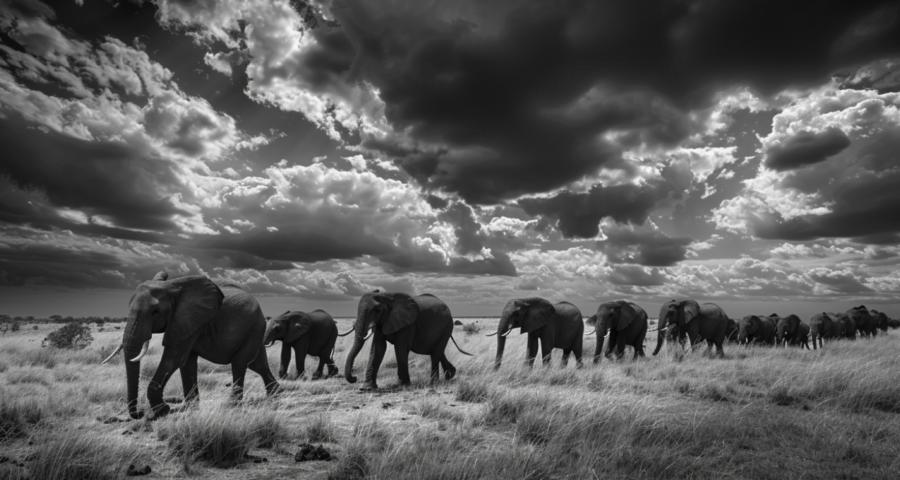
There is a long tradition of associating black and white with gravitas, and perhaps unfairly so. But it's undeniable that removing color heightens emotional pull. A herd of elephants in color is majestic; in monochrome, it's a study in stoic solidarity. A single raven perched on a post becomes the embodiment of solitude, not just a bird with glossy black feathers.It works because emotion is rarely encoded in color. Red does not always mean rage; blue skies do not always signal joy. Expression lives in posture, spacing, and contrast. By reducing the palette, you compel the viewer to notice those cues. A fox glancing sideways, a cracked desert floor stretching endlessly—both strike harder when you aren't seduced by oranges or purples.
When to Hold Back
Monochrome is not a universal solvent. Some scenes require the shock of hue. Imagine a kingfisher without its electric blue, or an autumn canopy reduced to neutral shades. The photograph might still work technically, but something vital would vanish—the reason you wanted to capture it in the first place.Overuse of monochrome risks turning powerful into pretentious. Not every beetle deserves the solemnity of grayscale treatment. Before converting, ask whether form, texture, or emotion really become more compelling in black and white. If the answer is "not particularly," then let the color remain. Monochrome is not a badge of seriousness, it's a choice of emphasis.
Examples That Stick
Consider a photograph of a shoreline battered by storm clouds. In color, the sea may look theatrically green and the clouds theatrically purple—almost too much. Switch to monochrome, and the focus shifts: not the colors of turmoil, but the jagged meeting point between land and water, the gradations of light that march across the sky. It stops being melodrama and becomes stark poetry.Or think of a herd of bison crossing a snowfield. In color, you may end up with large brown animals against a flat white background—charming but static. In monochrome, however, the bodies read as monumental forms etched into a sheet of paper. Suddenly, they feel like ancient glyphs moving across a canvas.
Even portraits of creatures benefit. An owl's stare in color is impressive, yes. But in black and white, those eyes are not just yellow—they're voids of intent, bordered by patterns that resemble woodcut engravings. The creature seems less bird and more oracle, which is far more memorable.
Common Missteps
Monochrome is not an automatic upgrade, though some photographers treat it that way, as if clicking "black and white" were equivalent to earning a graduate degree. Mistakes abound. The first is flattening. Without attention to contrast, a photo can end up looking like a smudged charcoal sketch of nothing in particular.Another misstep is sentimental overreach. An everyday squirrel, converted to black and white, does not become a symbol of mortality and resilience. It is still a squirrel, gnawing on a nut. Monochrome will emphasize fur texture and tail fluff, but it won't rewrite the meaning of the subject.
Lastly, watch for tonal mush. If you shoot a black bear against dark rocks, converting to monochrome may erase your subject entirely. You need tonal separation; otherwise, you've photographed camouflage at work, which is educational but not gripping.
Why It Endures
The persistent allure of monochrome lies in its insistence that viewers engage differently. It slows the eye, alters expectations, and adds gravity without theatrics. Color photography shouts; monochrome suggests. Neither is superior, but each is a different conversation.There's also a nostalgic undertone. Black and white connects us to early wildlife photography, where limitations forced the style. Today, choosing it is no longer necessity but intent. That intent is legible to the audience—they know you stripped away the plumage of hue to direct their gaze elsewhere.
Gray Matters
At its best, monochrome makes us see what was always there but overlooked. Branches twist into skeletal diagrams, dunes become abstract calligraphy, faces of animals carry stories without the disguise of color. It sharpens perception not by adding, but by subtracting.Think of it as editing nature's wardrobe: you've taken away the flashy garments to reveal the underlying bone structure. Sometimes the result is startlingly raw, sometimes elegantly restrained. Either way, it reorders the hierarchy of what matters in an image.
So when you next contemplate whether to press the "convert to black and white" button, remember: you're not just making an aesthetic tweak. You're rearranging perception itself. And if that squirrel does start to look like a timeless symbol of resilience—well, maybe you've stumbled onto something after all.
Article kindly provided by johansiggesson.com
Latest Articles
- The Quiet Design Details That Make Wedding Memories Feel More Personal
- The Psychology of Ceiling Height: How Vertical Space Changes the Way We Feel
- The Hidden Power of Product Demonstrations: Why Showing Beats Telling
- Beyond Family Portraits: Unexpected Photos That Make Stunning Wall Art
- Designing for Trust: The Hidden Visual Signals That Shape First Impressions
- Why Banner Design Is Still One of the Most Effective Local Marketing Tools
- Designing for Impatient People, and Why That's a Good Thing
- Borrowing Film Planning Techniques for Better Graphic and Web Design
- Designing with Light Instead of Filters: How Atmosphere Shapes a Photograph
- The Scent Wardrobe Principle: Designing Your Fragrance Collection Like an Interior Space
- How Small Visual Details Change the Entire Mood of an Image
- Turning Everyday Lighting Into a Design Feature
- Designing Photo Albums That People Actually Revisit
- Designing Illusions: How Sliding Wardrobe Doors Can Visually Reshape a Room
- Fit Over Fashion Why Tailoring Matters More Than Trends for Formalwear
- Why Fast Websites Matter More Than Beautiful Ones When People Are Choosing Where to Eat
- When Product Photos Quietly Sabotage Online Sales
- When a Wedding Day Quietly Becomes Its Own Photographer
- Why Gilded Elements in Art Still Resonate Today
- Why Your Product Photos Should Tell a Story
- Architecture
- Graphic Design
- Web Design
- Industrial Design
- Interior Design
- Fashion Design
- Photography
- Product Design
- UI/UX Design
- Landscape Design
- Animation
- Industrial Engineering
- Packaging Design
- Branding and Identity Design
- Exhibit Design
- Advertising Design
- Typography
- Motion Graphics
- Sustainable Design
- User Research
- Fashion Merchandising
- Film and Video Production
- UX Writing
- Environmental Design
- Print Design
- Interaction Design
- Art Direction
- Textile Design
- Game Design
- Virtual Reality (VR) Design
- General Design Principles
- Event and Wedding Design