From Minimal to Maximal: Print Styles That Actually Fit Your Decor
 You know that wall behind your sofa that looks like it's drafting a resignation letter That's where your print goes and yes the choice can make the rest of the room sit up straighter like it just heard its full name.
Minimalist black and white, or vibrant full colour nature photography — both can be right. The trick is understanding what your space is already whispering so your art doesn't stroll in and start shouting in the wrong language.
Read the Room Before You Hang the Room
Before picking a print, examine the scene like a set designer. What's the palette Are there strong architectural lines Is the furniture low and quiet or sculptural and lively Lighting matters too; cool LEDs will nudge colours toward clinical, while warm lamps lend generosity to shadows. If the room already has lots of visual "characters" — patterned rugs, expressive chairs — a black-and-white landscape can serve as the steady lead. If the room is monastic and beige, a burst of saturated colour can function like a witty aside that everyone remembers.Serious note: wall size dictates scale. A single large print calms a busy space by consolidating attention, while a grid of smaller frames adds rhythm to a quiet one. Measure, mask with painter's tape, step back. This is the cheapest mistake you'll never make.
Minimalist Black and White When Restraint Wins
Black and white is architectural by nature. It clarifies form, celebrates negative space, and refuses to clash with your cushions. In modern or Scandinavian schemes, a high-contrast mountain ridge or a misted treeline becomes a clean visual anchor. It also pairs beautifully with textured materials — wool throws, limewash walls, matte ceramics — because the absence of colour invites touch to do some of the talking.For work spaces or bedrooms, monochrome reduces visual noise. Your eye lands, rests, and doesn't immediately start thinking about tropical fish. Choose prints with decisive composition: strong diagonals, crisp horizons, or a single focal subject. Float-mount in slim black or natural oak frames; add generous white matting to let the image breathe. Avoid ornate frames unless you enjoy watching styles argue across the room.
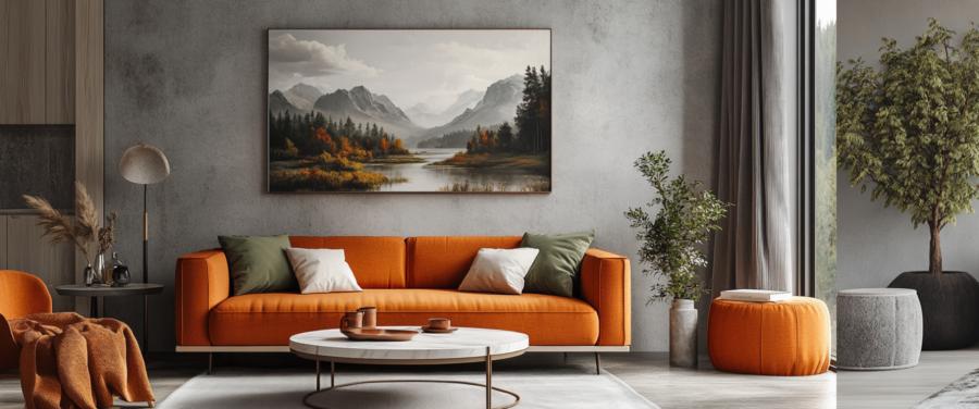
Vibrant Full Colour When the Room Needs a Pulse
Colour prints are mood machines. A glacial blue panorama cools a sun-baked living room; a sunset-heavy alpine scene warms a north-facing hallway on a rainy Tuesday. If your decor skews neutral, colour can supply the emotional content — the narrative arc the paint never wrote. In eclectic interiors, a big, joyful landscape gathers the chaos and crowns it with purpose.Keep to a disciplined palette. Pick two or three hues already present in the room — the rug's rust, the plant's green, the sofa's pewter — and find a print that resonates rather than competes. If you're fond of rearranging furniture at 11 p.m., choose images with broad tonal gradients; they're forgiving across lighting changes and wall shifts.
Where Bold Works and Where Subtle Saves the Day
Rooms aren't all built for bravado. A narrow hallway or small dining nook can feel claustrophobic with a hyper-saturated piece, while a large living room with high ceilings might swallow a delicate monochrome whisper. Use this quick guide:- Small, dark rooms — prefer monochrome with strong structure to add clarity.
- Large, bright rooms — embrace colour to keep the space from feeling chilly.
- Transitional spaces — choose mid-saturation images that won't jar between zones.
- Rooms with heavy pattern — anchor with black and white to steady the mix.
- Monochrome decor — inject one heroic colour scene to prevent aesthetic sleepwalking.
Let Function Dictate the Drama
Every room has its own rhythm and purpose, which should quietly bully your print choice into line. Kitchens, for instance, thrive on energy and movement — so a lively colour landscape feels right, echoing steam, conversation, and knives that could use sharpening. Bathrooms, however, reward calm restraint: a soft monochrome seascape or a fogged forest gives permission to exist in a half-dressed, contemplative state.Bedrooms require subtlety. You'll be looking at that wall from a semi-horizontal position, possibly while questioning every decision you've ever made. Harsh reds or high-contrast prints might accelerate that process. Go for images with tonal gradation and soft focus; photographs that breathe, rather than bark.
Workspaces crave definition. If your home office is one existential sigh away from a storage cupboard, install something graphic, bold, and assertive. A bright glacial ridge or golden forest shot can create a sense of forward momentum — useful when your email client feels like it's plotting your downfall.
Frame Game Strong
A frame is not a polite suggestion. It's the punctuation mark that defines the sentence your print is trying to make. Slim black frames convey discipline; pale woods speak in a calm whisper; white frames vanish, leaving the image to float like an idea. For colour prints, echo the faintest tone in the picture somewhere in the frame or mat — it's a subtle thread that ties the composition to its surroundings.Avoid cheap, reflective glass unless you enjoy seeing yourself superimposed on a snowfield. Non-reflective or matte glazing enhances texture and depth. And whatever you do, hang at eye level. Unless you're eight feet tall or expecting a gallery crowd of giraffes, that's roughly 145 cm from floor to midpoint.
Group Therapy
Sometimes, a single print feels lonely. A gallery wall can be marvellously conversational — if you stop it descending into chaos. Keep consistent spacing, align edges along a shared baseline or centre line, and think of the wall as a paragraph with a rhythm. Mix colour and monochrome only when there's a visual bridge: perhaps one black-and-white piece has a subject that appears in colour elsewhere, creating dialogue rather than confusion.In minimalist schemes, three large monochromes can establish authority. In maximalist ones, a burst of smaller colour prints creates a narrative sprawl — like guests at a dinner party, all interesting, all vying for attention. The key is balance: contrast visual energy without overwhelming the conversation.
Hanging Out with Intention
Light can be friend or traitor. Natural sunlight fades pigment; artificial light skews tones. Test your print under day and night conditions before final mounting. If you must place a piece opposite a window, use UV-protective glass. For spaces with dim ambient light, lean into high-contrast prints that maintain definition; low-contrast pastels will simply vanish into dusk.And remember the unsung physics: large prints need proper anchoring. Don't entrust your mountain vista to a nail you found in a drawer next to expired batteries. Use double hooks, wall plugs, or rails — because nothing ruins serenity faster than a slow-motion collapse.
Wall Stories and Happy Endings
Every wall in your home tells a story, whether it knows it or not. A carefully chosen print can redirect that story from "tenant waiting for deposit" to "person with taste and a mild air of mystery." Minimalist black-and-white imagery lends a sense of control, a self-editing poise. Bold colour prints suggest curiosity, appetite, a willingness to commit to beauty without apology.Whichever route you take, let authenticity lead. Choose prints that speak to what you actually live, not what a catalogue assures you is aspirational. A room that fits you will never go out of style — though you might occasionally swap the mountains for the sea, or the sea for a desert that looks suspiciously like ambition. Either way, your walls will know what they're doing, even if you don't always.
Article kindly provided by chamonixprints.com
Latest Articles
- Beyond Family Portraits: Unexpected Photos That Make Stunning Wall Art
- Designing for Trust: The Hidden Visual Signals That Shape First Impressions
- Why Banner Design Is Still One of the Most Effective Local Marketing Tools
- Designing for Impatient People, and Why That's a Good Thing
- Borrowing Film Planning Techniques for Better Graphic and Web Design
- Designing with Light Instead of Filters: How Atmosphere Shapes a Photograph
- The Scent Wardrobe Principle: Designing Your Fragrance Collection Like an Interior Space
- How Small Visual Details Change the Entire Mood of an Image
- Turning Everyday Lighting Into a Design Feature
- Designing Photo Albums That People Actually Revisit
- Designing Illusions: How Sliding Wardrobe Doors Can Visually Reshape a Room
- Fit Over Fashion Why Tailoring Matters More Than Trends for Formalwear
- Why Fast Websites Matter More Than Beautiful Ones When People Are Choosing Where to Eat
- When Product Photos Quietly Sabotage Online Sales
- When a Wedding Day Quietly Becomes Its Own Photographer
- Why Gilded Elements in Art Still Resonate Today
- Why Your Product Photos Should Tell a Story
- Crafting Interiors That Help Music Truly Come Alive
- Why Packaging Design Matters Even for Digital Products
- Color Palettes That Evolve: Creating Schemes That Shift With Time of Day, Mood, or User Context
- Architecture
- Graphic Design
- Web Design
- Industrial Design
- Interior Design
- Fashion Design
- Photography
- Product Design
- UI/UX Design
- Landscape Design
- Animation
- Industrial Engineering
- Packaging Design
- Branding and Identity Design
- Exhibit Design
- Advertising Design
- Typography
- Motion Graphics
- Sustainable Design
- User Research
- Fashion Merchandising
- Film and Video Production
- UX Writing
- Environmental Design
- Print Design
- Interaction Design
- Art Direction
- Textile Design
- Game Design
- Virtual Reality (VR) Design
- General Design Principles
- Event and Wedding Design