Designing Photo Albums That People Actually Revisit
 Some albums get flipped through once, admired politely, and then vanish into a drawer like a retired magician. Others get revisited, passed around, and quietly linger on coffee tables long after the event they document. The difference isn't just the quality of the photos—it's the design decisions shaping how those images are experienced.
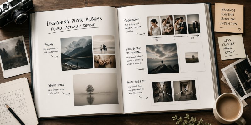
Pacing That Feels Human
Albums fail when they sprint. A hundred great images in rapid succession can feel oddly exhausting, like someone telling a story without ever pausing for breath. Pacing gives the viewer time to absorb, react, and anticipate what comes next.A well-paced album alternates between intensity and calm. A dramatic full-page portrait might be followed by a quieter moment—hands adjusting a sleeve, a glance exchanged across a table. This ebb and flow mirrors how memory works. Not everything is loud. Not everything should be.
Resist the urge to include every good shot. Editing is not an act of betrayal. It's an act of respect for the viewer's attention span, which is shorter than most photographers like to believe.
White Space Is Not Wasted Space
There's a persistent fear that empty space means missed opportunity. In reality, it's what allows the images to breathe. Without it, even the strongest photographs begin to compete with each other for attention, and nobody wins.White space acts as a visual pause. It tells the viewer, "This moment matters. Take a second." When used intentionally, it elevates a single image from part of a collection into something closer to a statement.
Minimal layouts can also introduce a sense of calm. A single image centered on a page, surrounded by space, carries a quiet confidence. It doesn't need to shout. It already knows it's good.
Of course, too much emptiness can feel sterile. The goal isn't to create a museum wall where viewers are afraid to breathe—it's to balance presence and restraint.
Sequencing That Builds Emotion
Image order is where albums either come alive or quietly fall apart. A strong sequence guides the viewer through a narrative, even if that narrative is subtle or abstract.Think in terms of transitions. A wide establishing shot can lead into tighter details. A moment of tension can resolve into something lighter. The sequence should feel like a progression, not a shuffled playlist.
One useful approach is grouping images by emotional tone rather than strict chronology. Events don't always unfold in a way that makes sense visually, but emotions often do. Aligning images by feeling creates cohesion, even when the timeline bends a little.
There's also value in surprise. An unexpected image placed at the right moment can reset attention and keep the viewer engaged. Just don't overdo it. Too many surprises and the album starts to feel like it's trying too hard to impress, which is never a good look.
Full Bleed Versus Minimal Layouts
Full-bleed images—those that stretch edge to edge—are powerful tools, but they work best when used with restraint. A full-bleed spread commands attention. It says, "This is important." If every page makes that claim, the effect quickly dulls, like someone speaking entirely in exclamation points.Reserve full-bleed layouts for moments of peak emotion or visual impact. A sweeping landscape, a defining gesture, or a scene that benefits from scale can justify taking over the entire page. It allows the viewer to step into the image rather than simply observe it.
Minimal layouts, on the other hand, create contrast. A small image placed thoughtfully on a page can feel intimate, almost private. It invites the viewer to lean in rather than step back. Alternating between these approaches establishes rhythm, preventing the album from feeling monotonous.
Guiding the Eye Across the Spread
An album spread is not just two pages—it's a single visual field. The way images are arranged should guide the viewer's eye naturally from one element to the next.Alignment plays a quiet but crucial role. Consistent margins, deliberate spacing, and thoughtful placement create a sense of order that the viewer may not consciously notice, but will definitely feel. When alignment is off, the experience becomes subtly uncomfortable, like a picture frame hung just slightly crooked.
Consider how the viewer's gaze moves. In cultures that read left to right, the eye typically enters from the left page and exits on the right. Placing key images or focal points along that path helps maintain flow. If the viewer's eye gets "stuck," the sequence loses momentum.
Here are a few practical ways to guide attention:
- Use leading lines within images to direct the gaze toward the next photo
- Place images with similar tones or colors adjacent to create visual continuity
- Avoid overcrowding spreads with too many competing focal points
- Let one image dominate when the moment calls for it
Consistency Without Rigidity
A cohesive album benefits from a consistent visual language—repeated margins, type choices, and spacing rules. This consistency builds trust with the viewer. It creates a framework that allows the images to shine without distraction.That said, strict uniformity can become predictable. Strategic variation keeps things interesting. Breaking the established pattern occasionally—introducing a larger image, shifting alignment, or changing the pacing—can create emphasis exactly where it's needed.
Think of consistency as the baseline, not the cage. The goal is to feel intentional, not mechanical.
Page Turner Appeal
An album that gets revisited has one simple quality: it makes people want to turn the page. That desire comes from curiosity, emotional investment, and a sense that something worthwhile is just ahead.End spreads with a hint of anticipation. Maybe it's a cropped detail that suggests a larger moment to come, or a quieter image that invites contrast on the next page. Small decisions like this accumulate, creating an experience that feels engaging rather than static.
Designing an album isn't about showcasing every image at once. It's about guiding someone through a series of moments in a way that feels natural, deliberate, and just a little bit irresistible. When done well, the album doesn't sit closed for long—it quietly makes its case to be opened again.
Article kindly provided by jordanalisaphoto.com
Latest Articles
- The Quiet Design Details That Make Wedding Memories Feel More Personal
- The Psychology of Ceiling Height: How Vertical Space Changes the Way We Feel
- The Hidden Power of Product Demonstrations: Why Showing Beats Telling
- Beyond Family Portraits: Unexpected Photos That Make Stunning Wall Art
- Designing for Trust: The Hidden Visual Signals That Shape First Impressions
- Why Banner Design Is Still One of the Most Effective Local Marketing Tools
- Designing for Impatient People, and Why That's a Good Thing
- Borrowing Film Planning Techniques for Better Graphic and Web Design
- Designing with Light Instead of Filters: How Atmosphere Shapes a Photograph
- The Scent Wardrobe Principle: Designing Your Fragrance Collection Like an Interior Space
- How Small Visual Details Change the Entire Mood of an Image
- Turning Everyday Lighting Into a Design Feature
- Designing Photo Albums That People Actually Revisit
- Designing Illusions: How Sliding Wardrobe Doors Can Visually Reshape a Room
- Fit Over Fashion Why Tailoring Matters More Than Trends for Formalwear
- Why Fast Websites Matter More Than Beautiful Ones When People Are Choosing Where to Eat
- When Product Photos Quietly Sabotage Online Sales
- When a Wedding Day Quietly Becomes Its Own Photographer
- Why Gilded Elements in Art Still Resonate Today
- Why Your Product Photos Should Tell a Story
- Architecture
- Graphic Design
- Web Design
- Industrial Design
- Interior Design
- Fashion Design
- Photography
- Product Design
- UI/UX Design
- Landscape Design
- Animation
- Industrial Engineering
- Packaging Design
- Branding and Identity Design
- Exhibit Design
- Advertising Design
- Typography
- Motion Graphics
- Sustainable Design
- User Research
- Fashion Merchandising
- Film and Video Production
- UX Writing
- Environmental Design
- Print Design
- Interaction Design
- Art Direction
- Textile Design
- Game Design
- Virtual Reality (VR) Design
- General Design Principles
- Event and Wedding Design