Why Fast Websites Matter More Than Beautiful Ones When People Are Choosing Where to Eat
 Someone standing on a sidewalk with a rumbling stomach is not in a patient mood. They are holding a phone, scanning nearby restaurants, and making a decision in seconds. That moment matters more than many businesses realize. If a restaurant's website loads slowly, refuses to behave on a mobile screen, or hides the menu behind confusing navigation, that potential guest may quietly drift away to the next option.
Speed has become a silent dealbreaker in modern dining decisions.
A beautiful design might impress a marketing team reviewing mockups on a desktop monitor. But people choosing where to eat are often doing it quickly, sometimes while walking, sometimes while negotiating with friends about tacos versus noodles. In that moment, performance beats aesthetics almost every time.
Restaurants that understand this build websites that move as quickly as hungry customers do.
Hungry People Are Not Patient People
Hunger has a funny way of shortening attention spans. When someone is actively searching for food, their priorities become simple. They want to know three things quickly:- What food is available
- How much it costs
- How close it is
Research consistently shows that even a few extra seconds of load time can dramatically increase the number of people who abandon a site. For restaurants, that abandonment can happen in the middle of a real-world decision. Someone standing across the street might simply choose the place next door because the menu appeared faster.
That outcome has nothing to do with food quality and everything to do with digital friction.
The internet has trained people to expect instant answers. When a website feels sluggish, the subconscious assumption is that the experience inside the restaurant might be just as slow. Fair or not, the impression sticks.
Mobile First Is Not Optional
Most restaurant searches happen on phones. That fact changes everything about how a site should be designed.Mobile screens are small, fingers are imprecise, and people are often moving while browsing. A website that works beautifully on a desktop can become frustrating on a phone if it wasn't designed with mobile users in mind.
Common problems appear again and again.
- Menus that require pinching and zooming
- Tiny buttons that are hard to tap
- Pop-ups that cover the entire screen
- Navigation that hides essential information
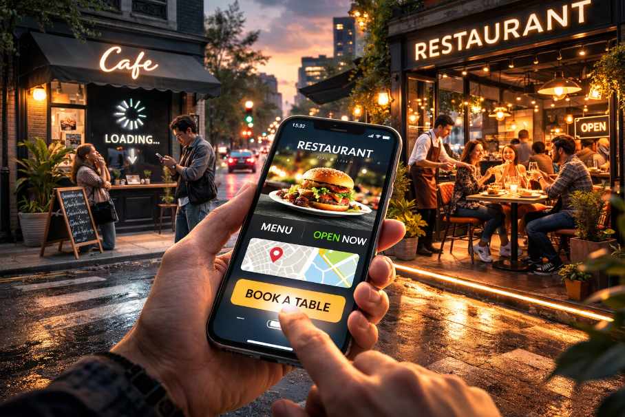
The homepage quickly shows the food style, a prominent menu link, location information, and possibly a reservation button. That's it. No elaborate digital gymnastics required.
Clarity works.
There is also a practical benefit to simplicity. Mobile-friendly websites tend to load faster because they use fewer heavy elements. Fewer oversized images and complicated scripts mean less waiting time for the user.
Nobody browsing for lunch wants to watch a spinning loading icon perform interpretive dance.
Menus Should Never Be Hidden
One of the most surprising mistakes restaurants make is burying their menu inside downloadable files or awkward interfaces.A PDF might look nice in a designer's folder, but on a phone it often behaves like a stubborn document that refuses to fit the screen. Users pinch, zoom, scroll sideways, and occasionally mutter things that would make a chef blush.
Menus should be easy to read instantly.
Clean text layouts work extremely well. Categories like appetizers, mains, and drinks should be clearly separated. Prices should be visible. If images are included, they should load quickly and support the information rather than slow it down.
A menu page is not the place for dramatic storytelling. It is the place where someone decides whether they want noodles, pizza, or a sandwich large enough to require a nap afterward.
Restaurants that prioritize speed and clarity make that decision easier.
Speed Quietly Builds Trust
Fast websites create a subtle but powerful impression. When pages load quickly and navigation feels effortless, visitors assume the business behind the site is organized and attentive. That perception matters when someone is deciding where to spend money.Restaurants operate in a competitive environment where trust can form in seconds. If a site feels smooth and responsive, it signals competence. If it stutters, freezes, or forces users to hunt for basic information, doubt creeps in.
People rarely pause to analyze this reaction. It simply happens.
A diner might not say, "This website took six seconds to load so I'm going somewhere else." Instead, they quietly move on while telling themselves that the other place "just looked easier."
Speed influences confidence, even when nobody notices it directly.
There is also a technical benefit. Faster websites tend to rank better in search results, especially on mobile devices. Search engines favor pages that load quickly and deliver useful information without delays. For restaurants, that can mean appearing higher when someone searches for nearby places to eat.
Visibility improves. Customers arrive sooner. Everybody wins.
Simple Structure Converts Curiosity Into Tables
Many restaurant websites try to impress visitors with visual complexity. Large photo carousels slide across the screen. Background videos play automatically. Fonts dance around like they've had too much espresso.The problem is that none of this helps a hungry person decide where to eat.
A better approach focuses on clarity and speed. The structure of an effective restaurant site is usually straightforward.
- Clear restaurant name and cuisine type
- Immediate access to the menu
- Location and map visibility
- Opening hours
- Reservation or booking option
- Contact information
Consider the common scenario of someone searching for dinner on a busy street. They open a site, scan the menu, confirm the location, and check whether the place is open. If all of that happens within a few seconds, the decision is practically made.
If instead they encounter slow animations, hidden menus, and confusing navigation, the restaurant two doors down suddenly becomes very appealing.
Digital convenience translates directly into real-world footsteps.
Design Still Matters Just Not the Way Many Think
None of this means design should be ignored. Presentation still plays an important role in communicating the personality of a restaurant.But effective design supports usability rather than competing with it.
Clean typography, thoughtful spacing, and strong photography can create a polished impression without slowing everything down. A few well-chosen images of dishes can spark appetite far more effectively than a gallery of enormous files that take ages to load.
Balance is key.
A restaurant website should feel welcoming and informative, not like a digital obstacle course. Visitors should move through it naturally, finding answers without effort.
When design respects speed and clarity, the result often looks better anyway. Simplicity has a quiet elegance that complicated layouts struggle to achieve.
Serving Speed on the Digital Menu
Restaurants invest enormous effort in the experience inside their dining rooms. Ingredients are chosen carefully. Lighting is adjusted. Music is considered. Service is trained.The online experience deserves the same level of attention.
A fast, mobile-friendly website removes friction at the exact moment people are deciding where to eat. It delivers menus quickly, confirms practical details, and reassures visitors that the restaurant is ready for them.
In the end, a website's real job is simple. It helps hungry people answer one question quickly.
Is this where I should eat tonight?
When the answer appears instantly, tables tend to fill themselves.
Article kindly provided by amplifycreativelab.com
Latest Articles
- Borrowing Film Planning Techniques for Better Graphic and Web Design
- Designing with Light Instead of Filters: How Atmosphere Shapes a Photograph
- The Scent Wardrobe Principle: Designing Your Fragrance Collection Like an Interior Space
- How Small Visual Details Change the Entire Mood of an Image
- Turning Everyday Lighting Into a Design Feature
- Designing Photo Albums That People Actually Revisit
- Designing Illusions: How Sliding Wardrobe Doors Can Visually Reshape a Room
- Fit Over Fashion Why Tailoring Matters More Than Trends for Formalwear
- Why Fast Websites Matter More Than Beautiful Ones When People Are Choosing Where to Eat
- When Product Photos Quietly Sabotage Online Sales
- When a Wedding Day Quietly Becomes Its Own Photographer
- Why Gilded Elements in Art Still Resonate Today
- Why Your Product Photos Should Tell a Story
- Crafting Interiors That Help Music Truly Come Alive
- Why Packaging Design Matters Even for Digital Products
- Color Palettes That Evolve: Creating Schemes That Shift With Time of Day, Mood, or User Context
- Exploring Subtle Details Found in Quality Swiss Timepieces
- How Adaptive Cabin Environments Let Chauffeured Executives Shift Effortlessly Between Rest and Focus
- Jewellery as Identity Encryption: Choosing Symbols That Speak Only to You
- From Minimal to Maximal: Print Styles That Actually Fit Your Decor
- Architecture
- Graphic Design
- Web Design
- Industrial Design
- Interior Design
- Fashion Design
- Photography
- Product Design
- UI/UX Design
- Landscape Design
- Animation
- Industrial Engineering
- Packaging Design
- Branding and Identity Design
- Exhibit Design
- Advertising Design
- Typography
- Motion Graphics
- Sustainable Design
- User Research
- Fashion Merchandising
- Film and Video Production
- UX Writing
- Environmental Design
- Print Design
- Interaction Design
- Art Direction
- Textile Design
- Game Design
- Virtual Reality (VR) Design
- General Design Principles
- Event and Wedding Design