How Small Visual Details Change the Entire Mood of an Image
 A chair can look guilty if you put it in the wrong corner.
That sounds dramatic, but photographs are built from tiny visual accusations. The subject may be a person, a product, a room, or a carefully plated dessert pretending not to be lunch, yet the background is often doing half the talking. It tells the viewer where to look, how to feel, and whether the scene seems calm, tense, elegant, awkward, warm, sterile, expensive, forgotten, or suspiciously close to a dentist's waiting room.
Designers, stylists, photographers, and creative directors spend plenty of time thinking about the obvious parts of an image: the lighting, the pose, the main object, the hero wall, the hero chair, the hero candle that costs more than a normal chair. But mood often comes from what sits behind the main attraction. Background details are not passive. They are stagehands with opinions.
Furniture Placement Is Quiet Storytelling
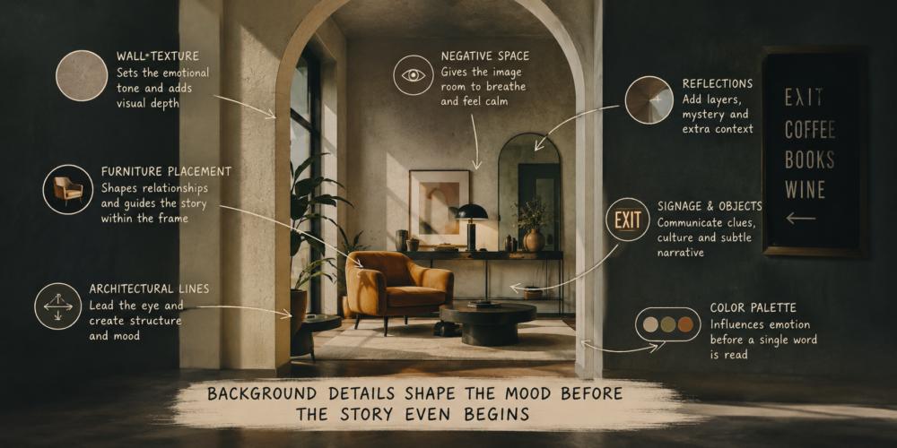
Furniture controls the emotional geometry of a photograph. A sofa pushed neatly against a wall can make a room feel stable and orderly. Pull that same sofa slightly into the space, angle a chair toward it, and suddenly the image suggests conversation, intimacy, or the possibility that someone interesting just left to make coffee.Placement creates invisible relationships. Two chairs facing each other imply dialogue. A lone chair by a window suggests reflection, solitude, or someone waiting for a text they absolutely should not reply to. A table crowded too close to a doorway can make a space feel tense, even if every object in the image is technically beautiful.
Good visual environments leave breathing room. Negative space is not emptiness; it is permission for the eye to move. When furniture is jammed into the background, the photograph can feel anxious. When pieces are spaced with intention, the image feels composed, even before the viewer understands why.
Walls Have a Personality Problem
Walls are rarely neutral. Smooth white plaster can feel clean, editorial, and calm. Exposed brick can suggest warmth, age, industry, or a loft owned by someone with strong opinions about espresso. Dark painted walls bring drama and depth, while pale textured surfaces soften the whole image.Texture matters because cameras notice surfaces differently than people do. A wall that feels subtle in person may become visually loud in a photograph. Heavy grain, chipped paint, glossy finishes, or patterned wallpaper can either enrich the mood or wrestle the subject for attention like a toddler near a birthday cake.
For designers, this is where restraint becomes powerful. A textured wall can add memory and depth, but it should support the story of the image. If the background surface is more emotionally complicated than the person standing in front of it, the photograph may start feeling confused.
Reflections Are Tiny Plot Twists
Mirrors, windows, polished tables, glass frames, and shiny tiles can make a photograph feel layered and alive. They can also introduce chaos with the confidence of an uninvited guest. A reflection may reveal extra light, architecture, movement, or atmosphere. It may also reveal a bin, a cable, a bored assistant, or the photographer's elbow making its big artistic debut.Used well, reflections expand space. They suggest there is more beyond the frame, which gives the image depth and intrigue. A soft window reflection can make a room feel airy. A mirror catching part of a doorway can create narrative tension. A polished tabletop can double the impact of light, colour, and shape.
Architectural Lines Direct Emotional Traffic
Lines quietly tell the eye where to travel. Vertical lines tend to feel formal and strong. Horizontal lines create rest and stability. Diagonal lines introduce movement, momentum, and occasionally the visual equivalent of caffeine.Architecture becomes especially influential in photographs because the camera exaggerates alignment. Long hallways, ceiling beams, stair rails, archways, and window frames all create pathways through the image. A perfectly symmetrical corridor can feel grand and controlled. A crooked angle can introduce tension, urgency, or the sense that someone set the tripod down during a minor existential crisis.
Creative environments often benefit from deliberate imperfection. Designers sometimes offset alignment slightly to avoid an image feeling sterile. A room that is too geometrically perfect can become emotionally distant. Human beings tend to trust spaces that look lived in, not spaces that resemble they were assembled by highly disciplined robots with marble countertops.
This is why architectural framing matters so much in editorial photography and branded interiors. Every line becomes part of the emotional script. Strong leading lines can pull attention toward a subject naturally, while cluttered structural elements can scatter focus across the frame.
Signage and Objects Carry Social Signals
Small background objects often communicate more than the main subject. A handwritten menu board, a stack of books, a glowing EXIT sign, or a neglected office plant all shape how viewers interpret the scene.Signage is especially powerful because humans instinctively read words inside images. Even partial text can shift emotional tone. Minimal signage with clean typography can make a space feel refined and contemporary. Bright cluttered signs can create energy or visual stress depending on context. Nothing says "peaceful luxury retreat" quite like a fluorescent laminated notice explaining the microwave policy in seven different fonts.
Props and incidental objects also influence authenticity. Overstyled backgrounds can feel artificial because real environments contain irregularities. A slightly crooked stack of magazines or an uneven curtain fold can make an image feel more believable. The trick is controlled imperfection. Genuine-looking spaces are often carefully arranged to appear accidentally beautiful, which is one of the more entertaining contradictions in visual design.
- Clean lines create clarity and focus
- Textured surfaces add emotional depth
- Reflective materials increase visual complexity
- Spacing between objects affects tension and calmness
- Architectural framing guides viewer attention
When Backgrounds Start Whispering Too Loudly
One of the biggest mistakes in visual design is assuming the background exists merely to fill space. Backgrounds constantly compete for emotional authority. If too many details demand attention at once, the photograph becomes exhausting to process.This is why experienced creatives edit aggressively. They remove objects, simplify colour palettes, soften reflections, and reposition furniture until the image feels emotionally coherent. The viewer may never consciously notice those changes, but they will absolutely feel them.
A successful photograph often depends on harmony between subject and environment. The background should not overpower the story, but it should deepen it. When every surface, line, object, and reflection works together, the image develops atmosphere without appearing forced.
Mood in photography rarely comes from one dramatic gesture. It comes from accumulation. The angle of a chair. The softness of a wall. The glare in a window. The spacing between objects. The line running toward a doorway. Tiny details stack quietly until the image begins to feel inevitable.
Out of Frame but Never Out of Mind
Background details shape photographs the way seasoning shapes food. Most people notice when it is missing, even if they cannot explain why. Designers who understand this gain enormous control over visual storytelling because they stop treating environments as decoration and start treating them as emotional infrastructure.The most memorable images are rarely built from subjects alone. They succeed because every background element supports the mood with subtle precision. Even empty space participates. Even silence inside a room can become visible.
And somewhere in the distance, just beyond the carefully composed lighting and elegant architectural lines, there is probably still a lonely chair trying not to look suspicious.
Article kindly provided by danielforsterphotography.com
Latest Articles
- The Psychology of Ceiling Height: How Vertical Space Changes the Way We Feel
- The Hidden Power of Product Demonstrations: Why Showing Beats Telling
- Beyond Family Portraits: Unexpected Photos That Make Stunning Wall Art
- Designing for Trust: The Hidden Visual Signals That Shape First Impressions
- Why Banner Design Is Still One of the Most Effective Local Marketing Tools
- Designing for Impatient People, and Why That's a Good Thing
- Borrowing Film Planning Techniques for Better Graphic and Web Design
- Designing with Light Instead of Filters: How Atmosphere Shapes a Photograph
- The Scent Wardrobe Principle: Designing Your Fragrance Collection Like an Interior Space
- How Small Visual Details Change the Entire Mood of an Image
- Turning Everyday Lighting Into a Design Feature
- Designing Photo Albums That People Actually Revisit
- Designing Illusions: How Sliding Wardrobe Doors Can Visually Reshape a Room
- Fit Over Fashion Why Tailoring Matters More Than Trends for Formalwear
- Why Fast Websites Matter More Than Beautiful Ones When People Are Choosing Where to Eat
- When Product Photos Quietly Sabotage Online Sales
- When a Wedding Day Quietly Becomes Its Own Photographer
- Why Gilded Elements in Art Still Resonate Today
- Why Your Product Photos Should Tell a Story
- Crafting Interiors That Help Music Truly Come Alive
- Architecture
- Graphic Design
- Web Design
- Industrial Design
- Interior Design
- Fashion Design
- Photography
- Product Design
- UI/UX Design
- Landscape Design
- Animation
- Industrial Engineering
- Packaging Design
- Branding and Identity Design
- Exhibit Design
- Advertising Design
- Typography
- Motion Graphics
- Sustainable Design
- User Research
- Fashion Merchandising
- Film and Video Production
- UX Writing
- Environmental Design
- Print Design
- Interaction Design
- Art Direction
- Textile Design
- Game Design
- Virtual Reality (VR) Design
- General Design Principles
- Event and Wedding Design