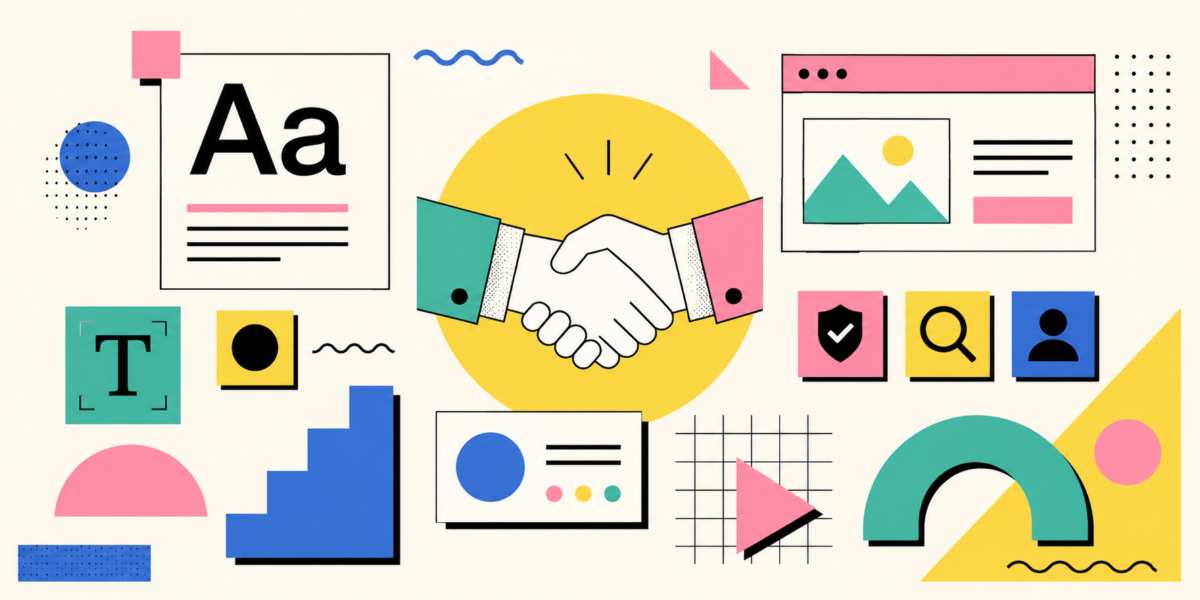
Designing for Trust: The Hidden Visual Signals That Shape First Impressions
 A website can shake your hand before a single word is read, and sometimes that handshake feels firm, warm, and professional; other times it feels like a damp receipt found in a parking lot.
Trust in design is rarely built by one dramatic choice. It usually emerges from dozens of small visual signals working together. People make judgments about credibility in seconds, often before they consciously evaluate content. Typography, colour, iconography, layout, and consistency all influence whether a brand, publication, or organization appears dependable. While users may not be able to explain why something feels trustworthy, they often react strongly when those signals are absent.
Typography Speaks Before Words Do
Typography is one of the fastest ways to shape first impressions. Readers may not know the name of a typeface, but they immediately notice when text feels difficult to read or strangely presented.Clean, well-spaced typography communicates competence. Consistent font choices create a sense of structure and control. When a financial services website uses a clear, professional typeface with strong hierarchy, visitors are more likely to feel confident navigating important information.
The opposite is equally true. A legal document printed in a decorative script font can raise eyebrows faster than a magician pulling a rabbit from a filing cabinet. Even accurate information can appear questionable when presented with poor typography.
Serious organizations often rely on restrained typography because readability itself signals respect for the audience. When users can quickly scan headings, identify key points, and understand content without effort, confidence increases naturally.
Colour Creates Emotional Expectations
Colour influences perception long before users begin evaluating facts. Different colour palettes create different assumptions about reliability, professionalism, and purpose.Many financial institutions use shades of blue because they are commonly associated with stability and dependability. Healthcare organizations frequently incorporate blues and greens to suggest cleanliness, safety, and calm. Luxury brands often use restrained palettes with strong contrast to project sophistication and confidence.
Colour alone does not create trust, however. A bright neon palette can work perfectly for a gaming brand while feeling completely inappropriate for an insurance provider. Context matters.
Poor colour choices can also create friction. Low contrast text, clashing colour combinations, or excessive visual noise make users work harder. When information becomes difficult to consume, credibility can suffer. People may not consciously think, "This colour palette seems unreliable," but they may still leave the page.
Icons and Symbols Carry Instant Meaning
Icons help users process information quickly. A well-designed icon can communicate purpose in a fraction of a second and reduce cognitive effort throughout an experience.Trust grows when iconography feels familiar, consistent, and clear. Navigation menus, security indicators, search tools, and contact options all benefit from recognizable symbols. Users gain confidence when they understand where actions will lead.
Problems emerge when icons become overly creative. Designers occasionally become so determined to reinvent familiar symbols that users end up playing a guessing game. If a shopping cart icon resembles modern art more than a shopping cart, confusion replaces confidence.
Across print materials, icons can improve comprehension as well. Annual reports, brochures, and instructional guides often use visual symbols to organize complex information. When done properly, these elements make content feel more accessible and professionally produced.
Layout Guides Perception
Layout quietly directs attention and influences how information is judged. Before readers evaluate a message, they evaluate the presentation. A well-organized layout suggests that the people behind it understand their subject and care about clarity.Whitespace plays a particularly important role. Some organizations become nervous when they see empty areas on a page and rush to fill every available inch. The result often resembles a suitcase packed five minutes before a flight. Information competes for attention, important details become harder to find, and users may feel overwhelmed.
Thoughtful spacing creates breathing room. Headlines stand out, supporting information becomes easier to scan, and key actions become obvious. Whether on a website, a brochure, or a product manual, clear structure helps readers feel oriented rather than lost.
Trust is also influenced by visual hierarchy. Strong headings, logical sections, and predictable navigation communicate professionalism. Users should not have to solve a puzzle simply to locate contact information or understand the next step.
Consistency Builds Confidence
Consistency may be one of the most powerful trust signals because it demonstrates control. When visual elements behave predictably, users assume the organization itself operates predictably.A website that uses the same typography, colours, buttons, and spacing throughout its pages feels deliberate and reliable. Likewise, printed materials that maintain consistent branding appear more polished and credible.
Inconsistency creates doubt. If one page uses three different button styles, another uses unrelated colours, and a third appears to belong to a completely different company, users may begin questioning what else lacks attention to detail.
This effect extends beyond branding. Consistent formatting in reports, invoices, presentations, and marketing materials communicates professionalism. Small visual mismatches can seem insignificant individually, but together they create an impression of disorder.
Trust Travels Across Media
The same principles apply whether someone encounters a company online or in print. A business card, product packaging, annual report, mobile application, and corporate website all contribute to a unified perception.Consider a company with an elegant website featuring refined typography and careful spacing. If its printed brochure uses inconsistent fonts, crowded layouts, and low-quality graphics, the credibility established online can weaken. Audiences often view every touchpoint as evidence of how an organization operates behind the scenes.
Strong visual design creates continuity. It reassures people that they are dealing with the same professional entity regardless of where the interaction occurs. That reassurance becomes particularly important when financial transactions, personal information, or long-term commitments are involved.
Making a Good Impression by Design
Trust rarely announces itself with flashing lights. It grows from visual decisions that appear ordinary on the surface but carry significant psychological weight. Clear typography improves readability. Appropriate colour choices shape expectations. Familiar iconography reduces uncertainty. Structured layouts enhance understanding. Consistency reinforces professionalism.When these elements work together, users feel comfortable engaging with content, exploring services, and making decisions. When they clash, confidence can erode surprisingly quickly.
The most effective designs often succeed because they make people feel secure without drawing attention to the mechanism behind that feeling. Long before anyone evaluates a promise, compares a price, or reads a detailed explanation, the visual presentation has already cast its vote. In many cases, first impressions are not formed by what a design says, but by what it quietly suggests.
Article kindly provided by jakejbryant.com
Latest Articles
- Beyond Family Portraits: Unexpected Photos That Make Stunning Wall Art
- Designing for Trust: The Hidden Visual Signals That Shape First Impressions
- Why Banner Design Is Still One of the Most Effective Local Marketing Tools
- Designing for Impatient People, and Why That's a Good Thing
- Borrowing Film Planning Techniques for Better Graphic and Web Design
- Designing with Light Instead of Filters: How Atmosphere Shapes a Photograph
- The Scent Wardrobe Principle: Designing Your Fragrance Collection Like an Interior Space
- How Small Visual Details Change the Entire Mood of an Image
- Turning Everyday Lighting Into a Design Feature
- Designing Photo Albums That People Actually Revisit
- Designing Illusions: How Sliding Wardrobe Doors Can Visually Reshape a Room
- Fit Over Fashion Why Tailoring Matters More Than Trends for Formalwear
- Why Fast Websites Matter More Than Beautiful Ones When People Are Choosing Where to Eat
- When Product Photos Quietly Sabotage Online Sales
- When a Wedding Day Quietly Becomes Its Own Photographer
- Why Gilded Elements in Art Still Resonate Today
- Why Your Product Photos Should Tell a Story
- Crafting Interiors That Help Music Truly Come Alive
- Why Packaging Design Matters Even for Digital Products
- Color Palettes That Evolve: Creating Schemes That Shift With Time of Day, Mood, or User Context
- Architecture
- Graphic Design
- Web Design
- Industrial Design
- Interior Design
- Fashion Design
- Photography
- Product Design
- UI/UX Design
- Landscape Design
- Animation
- Industrial Engineering
- Packaging Design
- Branding and Identity Design
- Exhibit Design
- Advertising Design
- Typography
- Motion Graphics
- Sustainable Design
- User Research
- Fashion Merchandising
- Film and Video Production
- UX Writing
- Environmental Design
- Print Design
- Interaction Design
- Art Direction
- Textile Design
- Game Design
- Virtual Reality (VR) Design
- General Design Principles
- Event and Wedding Design